Technology focus - in UX is less more?
Leaps in digital technology continue to transform the way we interact with vehicles. Here we look at the variety of approaches to touchscreens
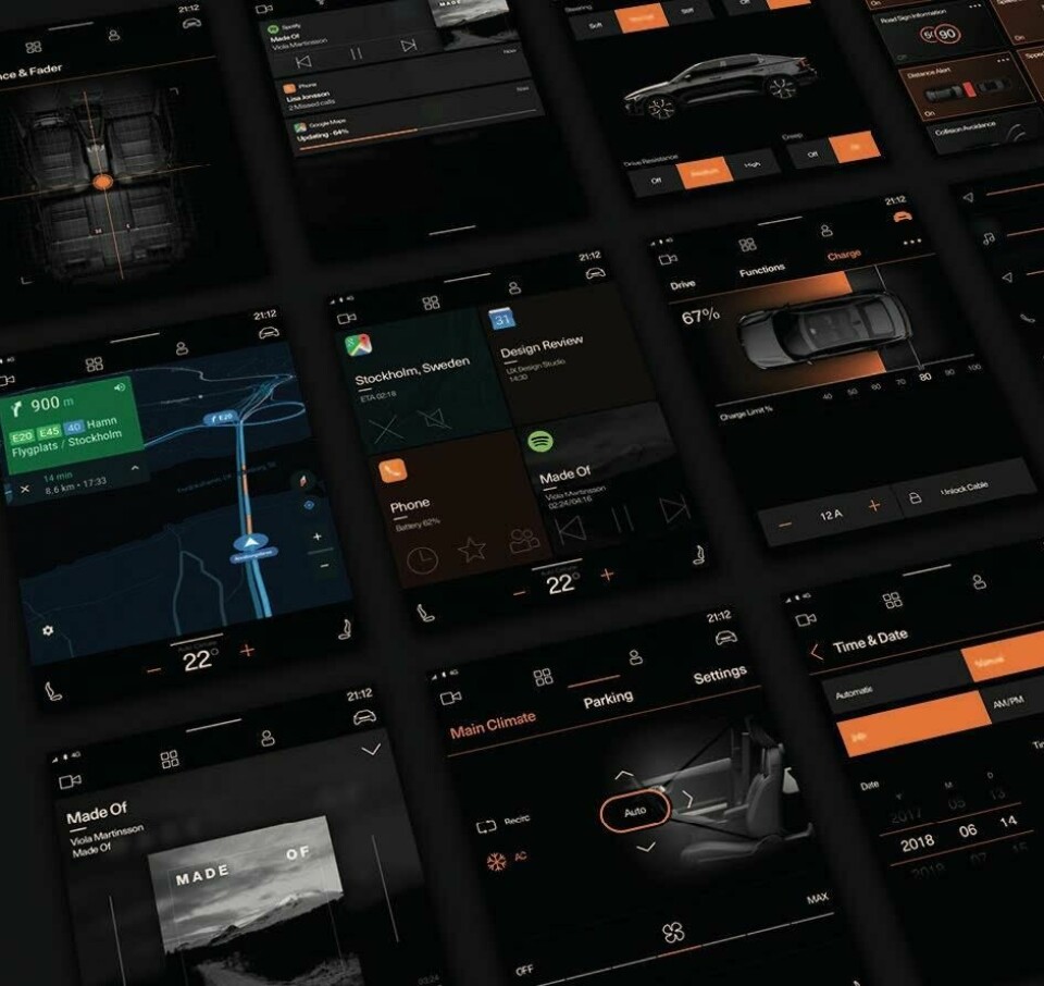
It’s more than five years since Apple moved to a flat design style for the iPhone’s graphical interface, with the September 2013 release of iOS 7. The following year, in June 2014, Google released its equally influential and almost equally flat Material Design framework, which brought greater simplicity and consistency to both its own software and third party apps on its Android mobile platform. Take a look at the average automotive user interface and you might never guess these two watersheds ever occurred. Skeuomorphism, rendered chrome, dramatic shadows and 3D flourishes, heavily graduated tints and pointlessly complex animations are generally alive and well in today’s instrument clusters and centre consoles. This situation is all the more surprising given that the core job of every in-car display is not to capture a user’s rapt attention but to impart information quickly and cleanly, in a momentary glance. A welcome shift in style is starting to become evident, however.
Concept cars including the Opel GT X Experimental, Tata H2X Concept and Fiat Concept Centoventi all explore the potential for simplified presentation with highly readable graphics. And the freshly launched Polestar 2 electric car includes perhaps the flattest user interface so far seen in a production digital cluster, with software based on Google’s Android platform. Opel design vice president Mark Adams says the GT X Experimental adopted the notion of a “digital detox”, stripping back the user interface to simple information that is “very easy to understand and very logical” in its presentation. “Your speed information is a big figure, really clear in the centre; the fuel gauge is not whether it’s full or empty – who cares – it’s how far you can go,” he notes.
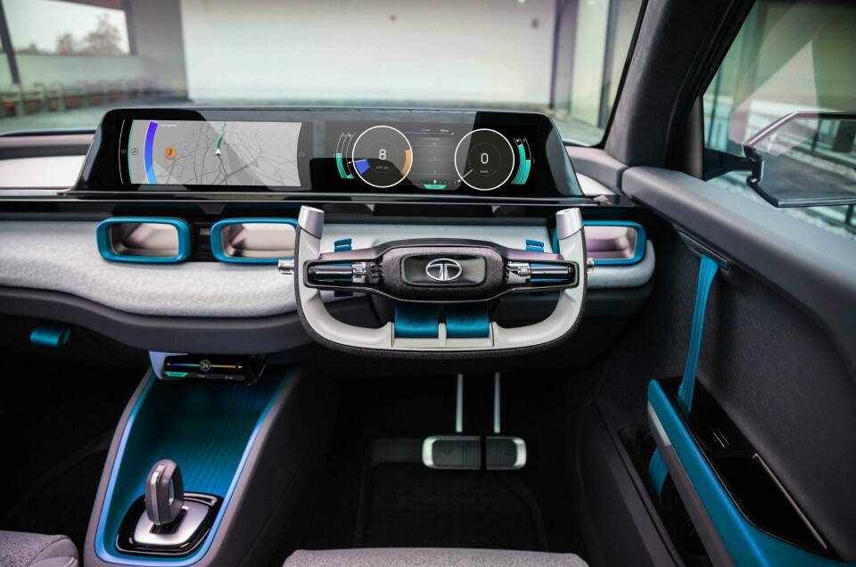
Tata’s team adopted a similar mantra with the H2X. “The auto industry tends to struggle with creating something really clean, bold and straightforward,” says the car’s lead interior designer, Zach Whitaker. “We tried to work on that, to get something that the customer can read really clearly. We’re bombarded with all this future-tech in the world, so how can we make very simple graphics, make them colourful and make them playful?”
More is more
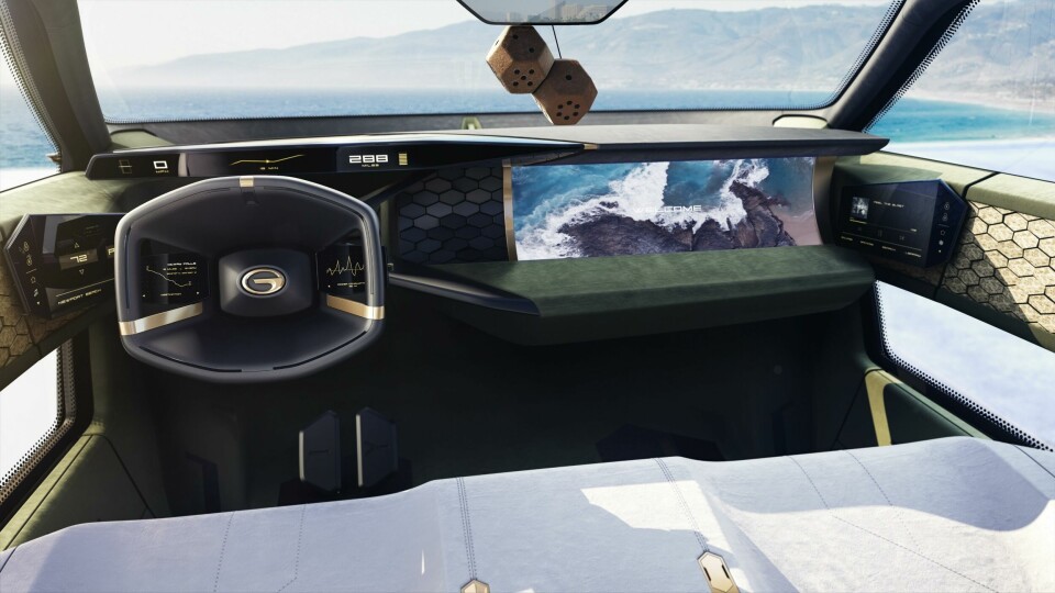
“We wanted the interior to have a twinkle in its eye, to be full of surprising and delightful touches that amuse, engage and attract both driver and passenger alike,” explains Ralph Kluge, Kia Motors Europe’s general manager of interior design. He’s talking about Imagine by Kia, the striking electric concept car that debuted in Geneva in March, with a dashboard seemingly modelled on a dinosaur’s spine,
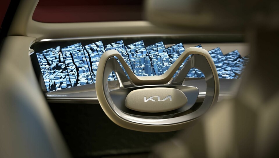
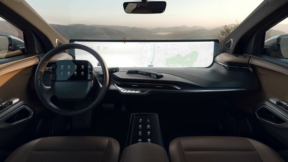
The array of 21 sharply angled screens certainly created a surprising impression. A somewhat tongue-in-cheek design, Kluge said they represented “a humorous and irreverent riposte” to the tendency towards more and bigger screens in cars. Startup Byton currently leads the field in large-screen real estate, with the production version of its M-Byte electric SUV, revealed at the CES show in January complete with a 48-inch curved widescreen.
Not a touchscreen itself, the “Shared Experience Display” is controlled via a 7-inch tablet embedded in the steering wheel, or through an 8-inch touchpad sited between the front seats. Digital replacements for door mirrors were made legal in Japan and Europe from 2016, and the adoption of this technology is fuelling a growing trend towards a pillar-to-pillar display approach.
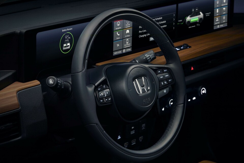
At the Geneva show, Honda revealed the near-production version of its e Prototype electric hatchback, featuring a linear shelf full of screens stretching right across the cabin. Two central displays for instruments and infotainment are flanked by two bookend screens showing images from the side-view cameras.
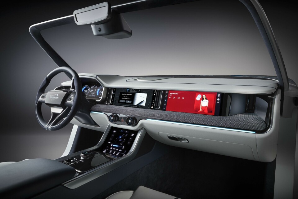
Parts supplier Harmann has showcased a very similar horizontal arrangement of multiple screens, with its Premium Digital Cockpit concept. There are, of course, many different ways to deploy multiple screens. At the Detroit show in January, GAC’s Entranze concept people-carrier showed off a particularly unusual assortment of visual interfaces. Twin touchscreens are built into the Entranze’s front doors (though not, surprisingly, for rear-view duties); two “helper” touchscreens extend out like paddles from the steering wheel hub, designed to turn along with the wheel; a thin strip of digital instruments provides driving data above the wheel’s rim, supplemented by a head-up display; and finally a widescreen “co-pilot” display mounted ahead of the front passenger is designed to be covered by a decorative blind when inactive. “Everything started with human needs,” explains GAC executive design director Pontus Fontaeus, speaking at the Detroit show. “It’s AI-supported, with voice control, and it’s a completely new take. Now every car looks the same inside – with a big screen and whatever – but we said, ‘No, we’ll do something that’s even more futuristic.’”