First sight: Tata’s new take on the classic Sierra launches in Delhi
Tata’s new take on an old classic reveals thoughtful approach to future mobility and the place of screens in our lives
The original Tata Sierra is a storied vehicle, an India icon not unlike the Land Rover Defender. While a complete redesign is exciting, it comes with potential pitfalls for design. The Tata design team has avoided them, though; this is a thoughtful and progressive electric SUV concept. “We are taking the spirit of the original Sierra and applying it to a non-retro car,” Martin Uhlarik, Head of Design UK, told CDN.
We will be covering the interior design story of the Sierra in more detail in Interior Motives magazine, but in the meantime here’s our first impression of this striking new concept from the Tata team.
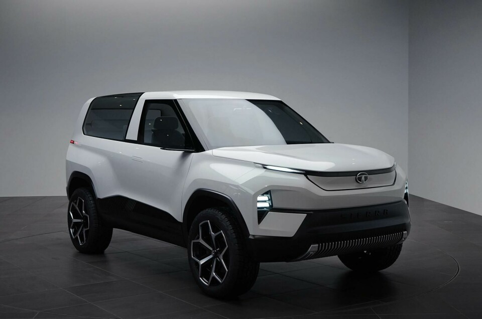
The size: Contrary to what it looks like in these photographs, the Sierra is actually quite small – just 4.25 metres long (the size of a Golf) – yet seems much larger, inside and out. It is based on the company’s compact ALFA architecture (as with the 45X concept and the Altroz EV, see here for more on Tata’s new platforms). Martin Uhlarik told CDN that when the team presented the ergonomic model to management, they couldn’t believe the dimensions and space, particularly once they were sitting inside. “I remember that as being a breakthrough moment,” Martin said.


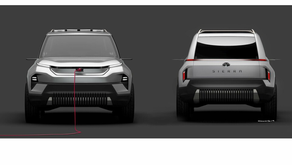
The glasshouse: If, like us, you are unfamiliar with the original Sierra, it was the three-door SUV launched in 1991 that turned Tata from being a company that only produced commercial vehicles into one that also builds passenger cars. Its notable and startlingly original glasshouse was pretty advanced for 1991, although it did present some problems with passengers overheating.
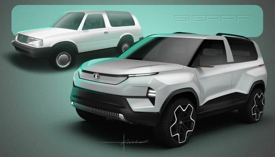
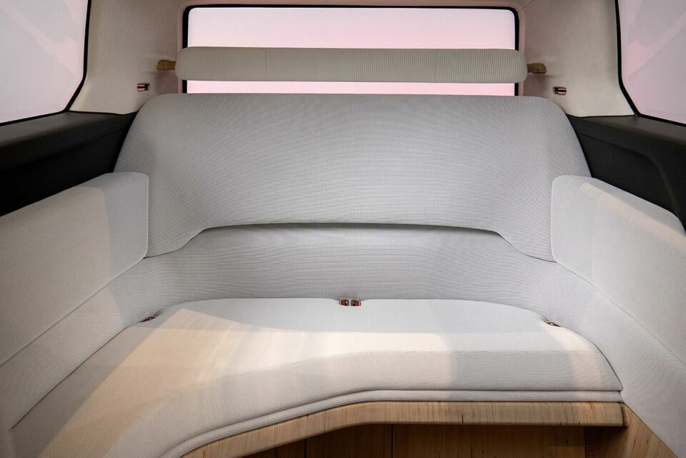
Despite this, the Sierra is remembered with great affection in India, partly because of its association with giving families the freedom to get out of the city, and partly because of its oddball yet highly functional looks. Redesigning it could have become an exercise in harvesting an old classic for nostalgia points. As Martin and Pratap revealed, the design team was aware of this right from the start. They told CDN that rather than papering the walls of the studio with images of the old Sierra, they took inspiration from the wraparound side glass, which became the starting point for the team with this project. Inside, the absence of a cant rail pillar gives rear-seat passengers a truly panoramic experience of the world around them.
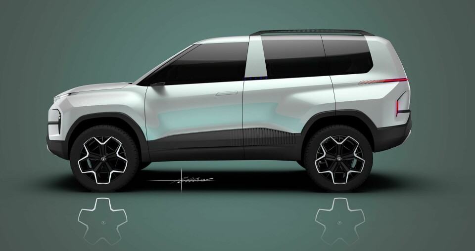
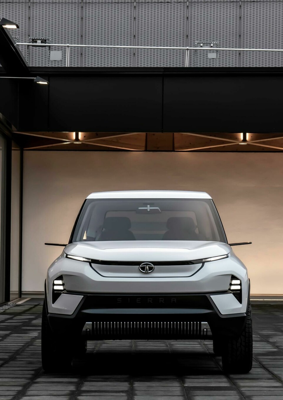
The face: There is a very interesting convergence of curves and symmetry on the Sierra’s face. It looks friendly but capable. The vertical grooves in the base create a gentle balance between the (white) top level of the car and the black lower part. Sculptural shapes in which the lights nestle add depth and warmth to the face, while the horizontally oriented lights emphasise width.
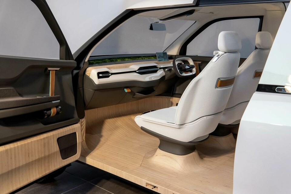
The doors: The original Sierra was a three-door car (which presented a few frustrations for families), so the team fixed on four doors for the modern Sierra – but cunningly designed it to present as three doors. There is a driver’s side door, with a rear-access, kerb-side sliding door, and another door for the passenger side (front). The sliding door is beautifully executed, disguised when closed and creating balanced symmetrical shapes when open. Once open, it also reveals the laminated, topographical MDF wood floor of the interior, with sculptural shapes supporting the seats and extending on to the base of the front passenger door. In the Indian context, having a sliding door isn’t just for nostalgia, or design, but highly functional especially for urban drivers. Pratap said: “In terms of ingress and egress, a sliding door is much more convenient than conventional doors. It can be parked in much tighter spaces, which is typical in an Indian city; you don’t really have much space to swing doors open.”
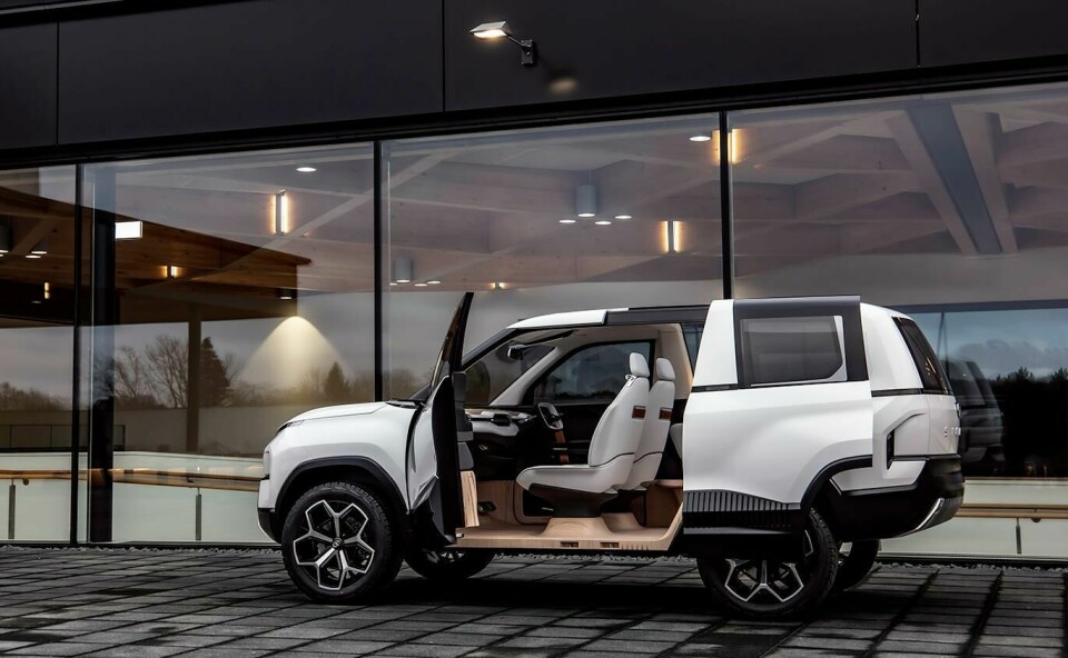
Martin and Pratap also revealed that this concept was designed with its use as a mobility solution in mind – it is easy to imagine it as a five- or seven-seat vehicle, or that it could be used as an uber-type product or airport shuttle. The size of the sliding door is designed to improve the ergonomics of ingress and egress – form follows function.
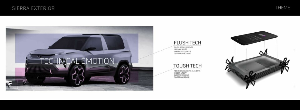
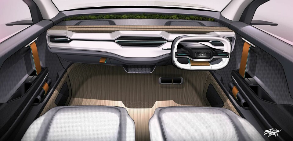
Two forms: There are two parts to this concept, the lower and upper. On the lower part, where the battery is housed, the team was inspired by the heat sinks on electronics. The symmetrical vertical grooves on the lower part of the doors and front and rear of the car signal the lower, functional form. Bose revealed: “We wanted to introduce this fluting aesthetic as you will find in a heat sink, or something that cools electronics. There are always these flutes which increase surface area for cooling. The lower black form has this fluting and the upper cabin is this human space where people sit, and then the junction of the upper and lower is this really clean, well delineated line which goes over the wheelarches into the lower sill and then around on the car. The clarity of where the human sits and where the tech sits is very apparent.” Internally this was referred to as ‘Flush Tech’ (upper) and ‘Tough Tech’ (lower).
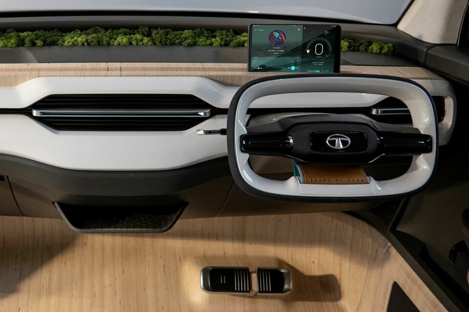
Digital detox: There is no screen. Instead we have the wooden ‘tech shelf’ on top of the dash. For this concept the team decided that the interior space of the car is where families will meet and bring their own portable devices. The wooden shelf (made of stratified plywood) has a groove along the middle, and you bring your own. “The original was about escaping the city and changing your life,” said Bose, “this Sierra does it in a totally contemporary way. Reclaiming your life means getting away from your email, the mobile device. It is a different way of approaching the same escape. Earlier you physically escaped and now you want to digitally escape. This car, by cleaning it all up, gives you that option at least.”
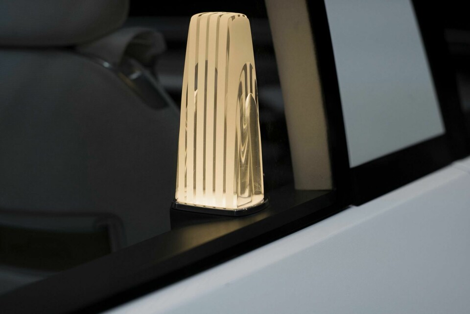
The moss behind the shelf under the windshield is designed to give an infinity pool-type effect, but rather than water, the moss blends seamlessly into the countryside (to which your Sierra has transported you). The lamp in the rear, reminiscent of a camping lamp, provides a focal point of warmth for the occupants to gather around. A beacon to offset some of the colder elements of modernism.
Vents: The absence of a complicated IP or screen allows for the focus to shift on to other interior elements, such as the air vents. In a hot country, having sufficient cool air is important, and signalling this with chunky, capable looking vents is smart – particularly as Bose revealed that “We want believable vent sizes and placement for when it goes into production.”
Making space: Given this car is quite small, the team faced the dilemma of whether to increase the width of the car or to use design to make maximum use of the space there is. Bose revealed that they wanted the car to be in proportion with other vehicles on Indian roads. The materials chosen for the interior, the simple, lightweight approach to the seats, the upright body style and the horizontal themes throughout, when combined with the glasshouse, all work to create a sense of space. The exterior lights further emphasise the width of the vehicle, while the use of lighter colours for the ‘Flush Tech’ parts of the car conveys lightness and agility. Even the steering wheel is designed to emphasise width.
We think this is a very interesting concept not only for its elegant functionality and progressive update of a classic, but also because it takes a product-design aesthetic and warms it up. The curves, both inside and out, intersect calmly with the volumes, and the vertical and horizontal punctuations, giving us another iteration of the product-inspired exterior designs we have seen in 2019. The Sierra won’t be coming to Geneva 2020, but CDN will be covering it in more detail as part of an Interior Motives story to come.


Full gallery of images of Sierra concept