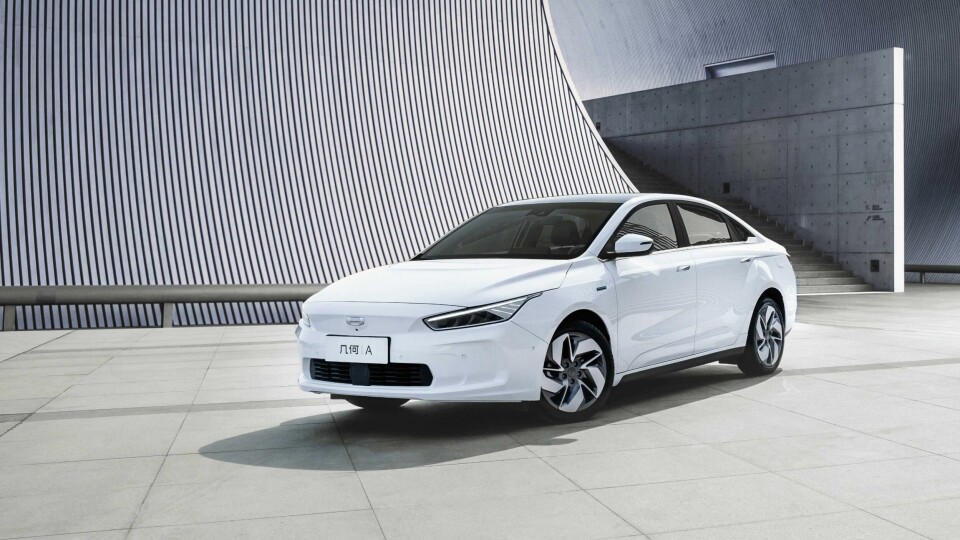
Interior Motives: Geometry A
The first car from the new Geely sub-brand Geometry is a confident start
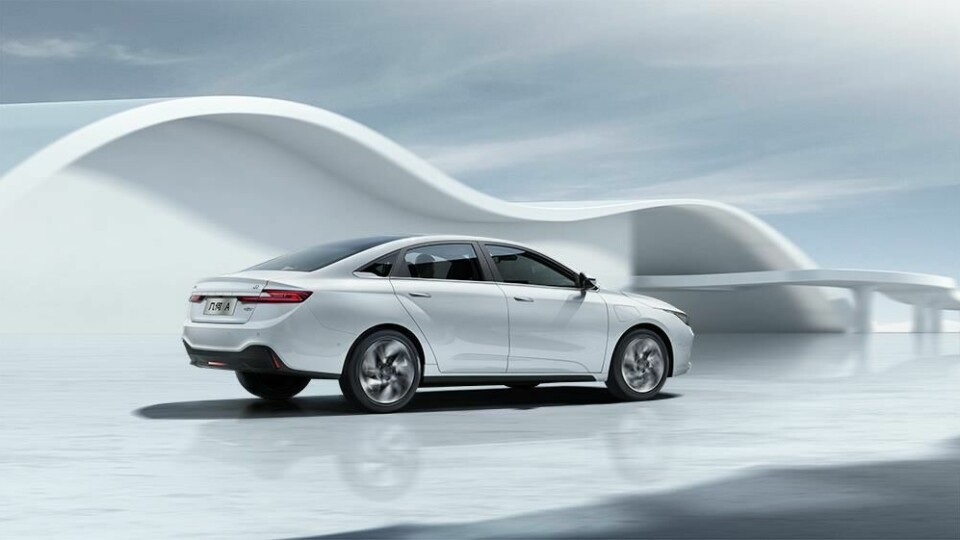
The announcement of Geely’s brand-new electric car sub-brand Geometry, so fully-formed and sophisticated, was a shock to many at the 2019 Shanghai motor show. Demonstrating the speed – and style – of change in the Chinese automotive market, and featuring genuine innovations previously reserved for concept cars, the Geometry A (seen here in early production form) has an interior which is a revelation for a car in its price-bracket.
The Geometry A had a smooth development programme too, says Guy Burgoyne, design VP, Geely Design China. “In this project, it wasn’t a case of the design department doing something they couldn’t, and then the engineering team getting annoyed about it,” he begins with a broad smile. “It was really good-natured, and there were no big egos that stopped collaboration. Everyone had a common goal.”


Early sketches
The togetherness Guy Burgoyne describes can only have helped with what was extremely rapid design development – the project kicked off properly in 2016, and was finished in 2018. “We were pretty quick,” he confirms. “That’s one of the things at Geely that is quite amazing. We make a decision and stick with it. For a designer, that sense of urgency is really invigorating. If you procrastinate about design too much, in general, it gets very conservative. If you’re a bit more ‘go for it’, often nice and surprising things can happen.”
Indeed, Burgoyne reveals that the interior design chosen for production was actually the most radical proposal of the lot. The model’s mood boards suggest inspiration from the geometric artwork of MC Escher and the conceptual architecture of Roman Vlasov, as well as the furniture of Alexandre Boucher. The idea of shrink-wrapping was also explored, as seen in the images of the wrapped mask and how its forms become integrated with the surface below.
The early “doodles” and sketches show how some of the forms from the inspirational images were translated into the context of the car’s instrument panel and cockpit structure. “Some designs were so simple they were in danger of being a bit dull,” Burgoyne explains. “One of my concerns with electric cars in general is that there’s this analogy that as they’re electric, they should be simple, as if that somehow relates to their impact on the environment. We don’t think it should be ‘naked’. Light? Yes. But it doesn’t need to be simple to be light. You just need to be clever where you’re putting the lines to make it look less heavy.”
The advantage of packaging the A’s cabin above an electric platform was mined, too. “We had the opportunity to move a few things around, and because of the electric powertrain, the angle we took for the interior was for it to feel as light and spacious as possible,” Burgoyne continues.
“The stuff we had to have in there – the safety, airbags, etc. – we shrink-wrapped and said, ‘this is our starting point. We don’t want this thing to gain weight’. The IP is really hollowed out where it can be, to give a sense of space, and that went through everything we did. We had a very consistent thinking throughout colour and materials, interaction, graphics and switchgear. It’s super-considered, more so than any project I’ve ever worked on before.”


Sketches and hexagon theme
Continuing the shrink-wrapping approach, the steering wheel was made very small; not to aid the driver in making quicker turns – the A is far from being an agile sports car – but, says Guy Burgoyne, “to make the interior feel as massive as possible.” The driver cluster is also small, with a greater focus on the head-up display, and there is only one central screen in the middle of the instrument panel, which all occupants can easily access. “If you manage to shrink one thing and enlarge another, you can really change the proportions and that was definitely what we’ve managed to do with this interior,” Burgoyne adds. “We managed to make a high console, which we like in all Geely cars, so you feel like you’re really sitting ‘in’ the cabin.”


Verification model, C&T
Against this take on proportional space, the details really stand out in the Geometry A’s cabin. The three-dimensional hexagon motifs on the IP’s upper and outer edges (which complement exterior forms) are visually pleasing, and hide functional air vents too. Similarly, the diagonally divided centre console – one side for storage, and the other for controls – compartmentalise different functions but also make the unit appear tapered and longer than it actually is. The ‘controls’ side of the tunnel is a masterclass in fit and finish, housing a recessed electronic parking brake switch, flush starter button and proud knurled rotary gear selector. The innovative part beyond is the embedding of back-lit controls under the console’s surface. D, N and R lights (for Drive, Neutral and Reverse gear positions) sit under that surface, plus there are further touch-sensitive buttons for Hill Descent, Sport mode and more.
Those under-surface controls were seen to be sometimes hard to spot in the early-production model, in fairly bright sunshine, but Burgoyne says the Geely team are working on improving this feature. “I wouldn’t pretend we didn’t have an issue with this,” he concedes honestly and quickly. “What we love is that when it’s off, you don’t see anything. But when it’s on, we need enough light to come out to be readable. It’s something we’re working on in production.” Further tech in the shape of a capacitive strip under the main touchscreen allows easy fingertip control of regularly-used air con functions, to sensibly avoid over-reliance on the touchscreen alone.
A verification model was built, and colour and materials applied. Inspiration at this stage came again from the artist MC Escher, as these images showing samples suggest.


Final interior
The Corian- or ceramic-like white/cream finish around the central storage area is an original material for an automotive application, while the grey marl-style fabric on the central part of the seats feels modern – and is apparently even soft and strong enough to be certified for use in baby clothes. The interior manages to balance modernity with humanity, as Guy Burgoyne concludes: “It’s very easy with electric things to try and make them into robots, cold machines. We didn’t want to fall into that trap.”

Dimensions: Length 4736mm, width 1804mm, height 1503mm, wheelbase 2700mm.