General Motors redesigns its logo to herald its electric future
With models like the Cadillac Lyriq and the Hummer EV, General Motors believes the future is electric. What better way to usher in a new era than with a new logo
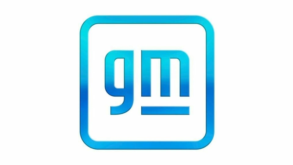
General Motors has redesigned its logo for the first time in 60 years to herald its all-electric future, and it is all about the ‘m’. The imperious all-caps GM of the last half century is gone, replaced by a lower-case interpretation with the ‘m’ of the acronym suggestive of an electric plug – albeit a British three-pronged version. Gone too is the underline, which is now truncated to sit exclusively below the ‘m’.
General Motors has made no secret of its wholesale move towards a pure EV line-up with some 22 vehicles to launch by 2023 for all four nameplates: Cadillac, Chevrolet, Buick and GMC. That will go up to 30 vehicles by 2025. The recalibration means that three quarters of the work GM is doing across the brand studios is related to EV.

The logo, which breaks with the uppercase convention established in 1938 is a very literal signifier of how GM sees its future.


