Bold, clean and spacey: Lynk & Co interior team on the Z10
Car Design News takes a closer look at the interior of the Lynk & Co Z10, which draws inspiration from spacecraft
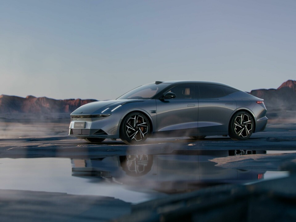
The Z10 (pronounced zee one zero) aims to blend high performance with luxury and builds on the 2022 The Next Day concept car. While the similarities outside are clear, it is less obvious how the concept inspired the interior of the Z10.
The overall feel of this production car is one of minimalism, infused with hints of technology. Some subtle, some in your face – literally.
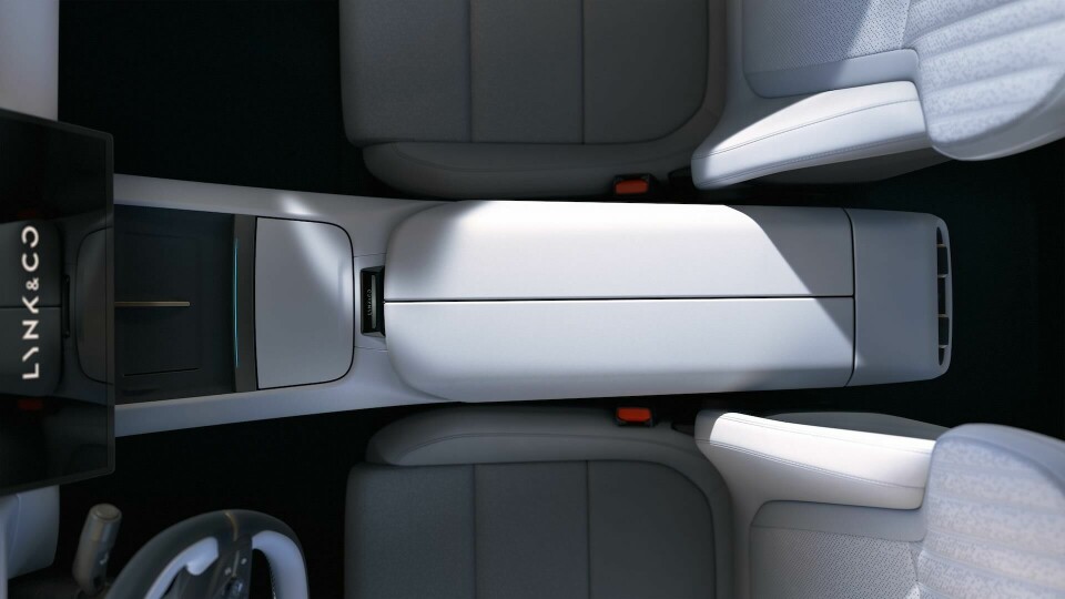
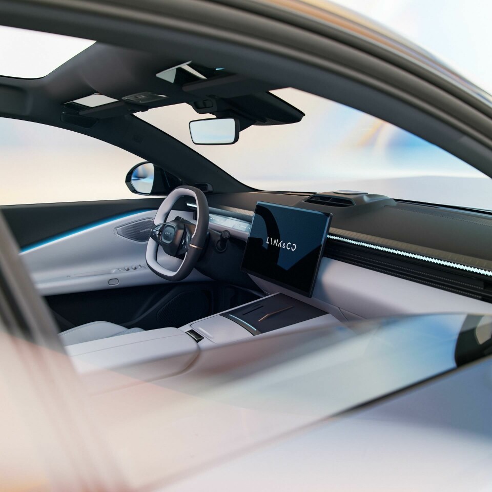
The dash is separated by a horizontal light bar, a feature that is present elsewhere in the range including the 02 we saw in Milan last year. This flows through to the door cards in the form of ambient uplighting, and in combination this flash of colour separates the darker upper IP and white central section. The steering wheel too is a black and white split, although other configurations appear to show a more neutral cream and grey theme.
“The interior embodies both boldness and cleanliness,” says lead designer Victoria Gadzhieva, who describes the theme as a “calmer, more distilled reflection” of the evolving mindset of Lynk & Co’s Chinese customers. Again, as with the 02, the expression ”aerodramatic” is also employed with the Z10, but we might propose that “aeroserenity” is more apt. It certainly feels more calming than dramatic. Gadzhieva elaborates.
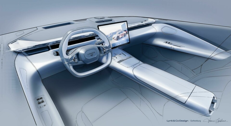
“We imagined a fictional flight to the moon, drawing inspiration from the most advanced form of travel: space,” she says. “With its distinctive technical shape, the ‘Aerodramatic Wing’ dashboard contrasts beautifully with the soft sculptural surfaces it interacts with.”
We wanted a focussed and precise feeling to the steering wheel, with real physical buttons
Indeed, the connection between the door and the IP is in direct contrast with the upper IP, and in combination with the raised air vents creates the impression of a spaceship about to land on a lunar surface.
It might seem a little wistful, but conversations like these are incredibly useful as they answer the pivotal questions of “why is that there, and why does that look how it does.” There is always a story behind it, a set of guiding themes that may not be immediately clear.
Gadzhieva is particularly fond of the connection between the IP and door (shown above). “The trumpeted shape flawlessly merges the door end cup creating the wrap-around feeling around the driver and passenger,” she explains. “It is the main element of the architecture we have been following at Lynk&Co for our future cars.”
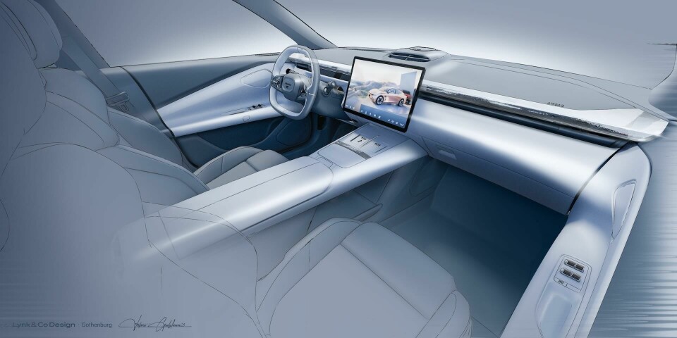
The central touchscreen – seemingly a non-negotiable now – takes pride of place at the heart of the IP, planted rather than integrated, and spanning the width of the centre console. A much smaller instrument cluster display sits behind the steering wheel, made possible by the inclusion of a head-up display.
While the screen does appear a little overpowering, as many do, in this writer’s opinion, the team was conscious to provide analogue interactions as well and backs the decision to “proudly” display key technologies. “We are making our technologies more visible and highlighted, rather than trying to conceal them. Our focus has been on making one particular element stand out… We [also] wanted a focussed and precise feeling to the steering wheel, with real physical buttons!”


The team appears to have given close attention to component design, from the fluted window switch buttons – almost as if from a high-end kitchen – to the joysticks on the multifunctional steering wheel. As it happens, Gadzhieva highlights the detailing as potentially her favourite element of the interior.
“The design of two horizontal blade-shaped switches is reminiscent of an aeroplane throttle lever, evoking a sense of control, precision and a more dramatic experience for the customer.” Sketches shared by the team illustrate how those window switches “sit like little spaceships” that have landed on the landscape of the armrest.
Some 2.5 years went into this particular project
Returning for a closer look at the steering wheel, it is minimal but by no means boring. The upper opening improves visibility of the instrument cluster, while the flat-bottom shape lower down gives more of a driver-focussed feel. Maybe not quite ready for a track day, but certainly good enough for spirited driving. “The shape really fits like a glove in the car,” notes Gadzhieva, “it’s the most compact of steering wheels in our range of vehicles, seamlessly combining form and function.”


A pair of wireless charging pads occupy the top of the centre console ahead of the long, slender armrest, supported by another light bar and cubby-hole lid. Rear passengers are met by a rather sculptural seatback with fabric pull tab, a surprising inclusion that feels more in line with rugged product design or even racing than luxury. Perhaps that is where the “high performance” theme comes in.
The interior of the Z10 was designed during the COVID era and the combination of remote work and travel restrictions made it challenging, yet memorable. “Travelling to China and reconnecting with the team was a wonderful experience,” recalls Gadzhieva, “and seeing the models assembled and meeting our colleagues in person were truly exciting moments.”
It is perhaps taken for granted how much work goes into projects like these. Chinese brands have accelerated production schedules massively, more than halving the industry standard in many cases. Despite that, some 2.5 years went into this particular project as it moved from concept through to the final stages. It is a significant operation, as the full list of designers involved in the project outlines below.