How proportions influence a car’s perceived value
Using the Toyota Mirai as a case study, design strategist Jelle Tjebbes argues that the package often has a far greater impact on the perception of value than exterior styling
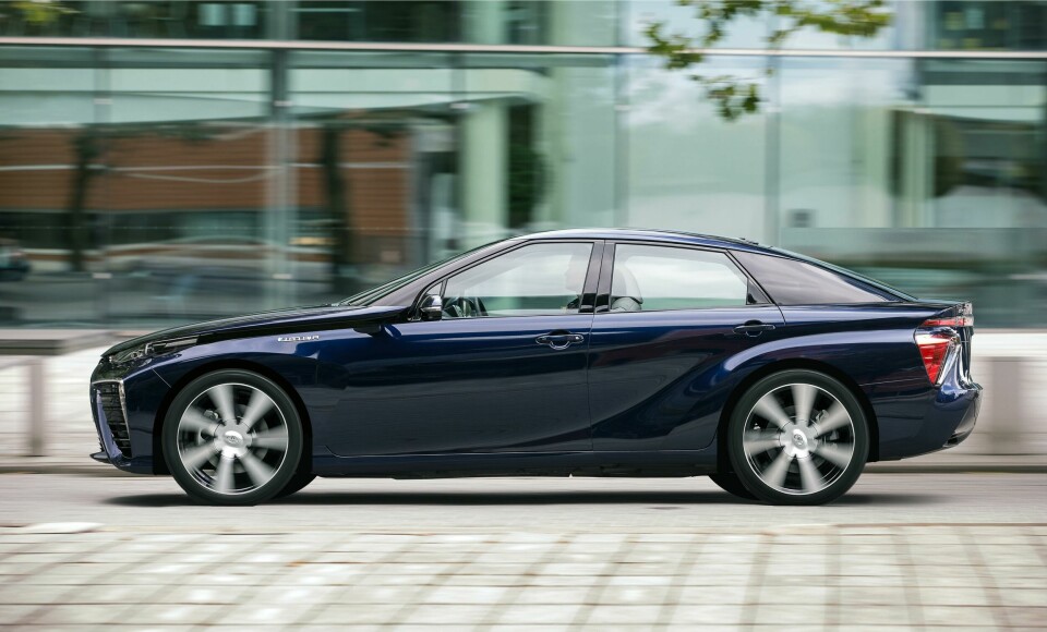
Take a look at the pictures below, and question, which of these two cars is an 80,000 euro car? You guessed right, they both are, but only one of them looks like it. The first generation Mirai is often frowned upon as an ugly design thanks to its busy exterior. And while it is easy to point that aspect of the design out as particularly polarising, in actuality those creases are working hard to hide a much bigger design issue: the package. The package has a far greater impact on the perception of value than exterior styling.
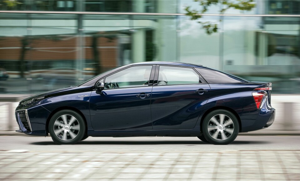
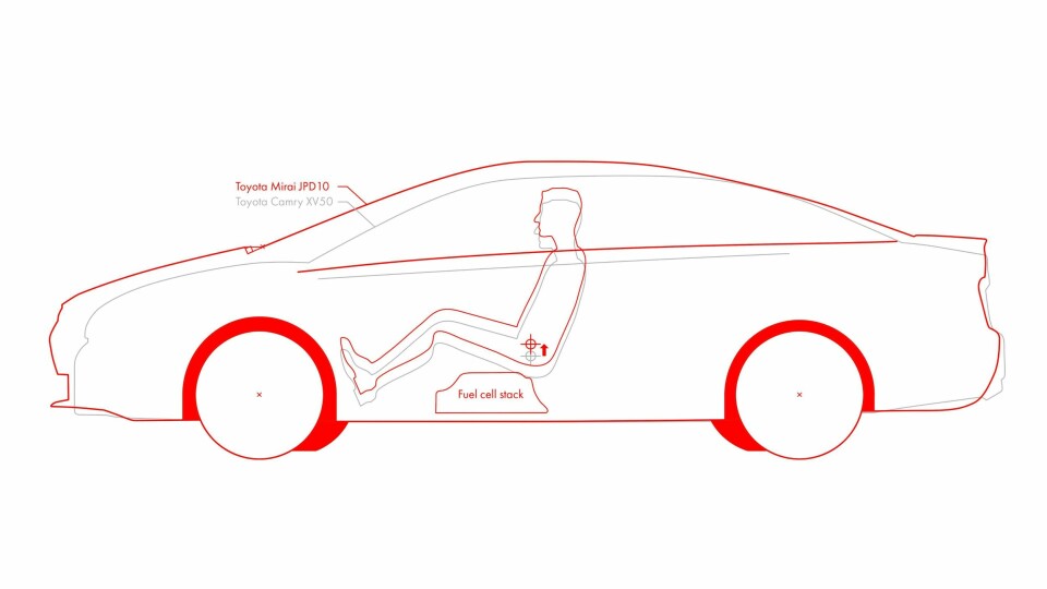
The platform of the first generation Mirai was also used by the Toyota Camry (XV50) and Lexus ES (XV60). Packaging all the big hydrogen components however, ultimately caused design issues. The placement of the fuel cell assembly and hydrogen tank underneath the seats raised the H-points, some 60-70mm I suspect, after analysing the data. That, in turn caused the roof, cowling and beltline to move up as well. Moving the cowl forwards compromising the premium feel of the vehicle. Nevertheless, this may have been necessary owing to aerodynamic requirements or simply to relate it better with its eco-brother the Prius.
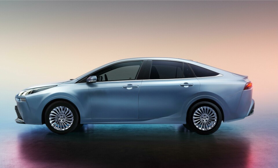
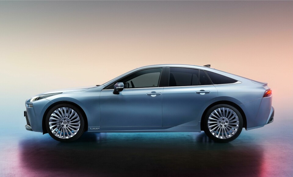
Quite the contrast to the second generation Mirai. Based on the TNGA-L platform, shared with the Lexus LS (XF50), the components are easier to package and the 2020 Mirai gets to maintain its classic premium silhouette, with long bonnet, low roofline and big wheels. The styling theme is much calmer but this is mainly made possible by the good proportions of the underlying architecture.
I’m not here to argue they should have done the same for the first generation, the L-Platform of the LS (XF40) was a much more expensive platform and it probably would have sent the price skyrocketing. I’m merely pointing out that the designers are heavily dependent on the package they receive, and as a consequence need to mask its deficits. As designers we know this, and we will do everything in our power to improve the package in the early phases of the project. The Mirai makes the perfect case to visualise the effects.
Back to my original promise, as these words won’t have you convinced that the wavy theme doesn’t impact the value perception that much. So watch what happens when we reverse the proportions of both Mirai’s, while staying true to the styling themes. Have a look at the photoshop image below and now ask yourself again, which of these cars looks like an 80,000 euro car? An image says more than a 1000 words.