Design Essay: Big Screen, Big Problem?
Automotive interior design is being subjected to ever tougher screen tests…
Electronic screens. They are, without doubt, one of the defining artefacts of modernity. Much like the ‘horseless carriages’ which roam our streets, the sophisticated and sometimes intoxicating displays ubiquitous in today’s homes, offices and pockets would no doubt have been considered nothing less than witchcraft a few hundred years back.
Though their progression from objects of wonder to everyday essentials has been remarkably similar, it has not (surprisingly) been until recently that the paths of the electronic screen and the motor car have begun to converge in any meaningful way.
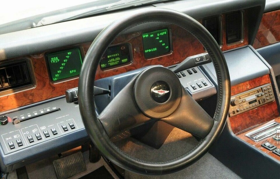
Notwithstanding comical early attempts at in-car tech, such as the CRT monitors fitted to Aston Martin’s Lagonda series 3, driving was for many years one of few routine activities to provide our eyes some much-needed respite from screen glare.
Alas, no longer. The big screen has been by far the most conspicuous addition to the typical car interior in recent times, in part thanks to the multitudinous features (and frustrations) on offer, but also the often-clumsy integration and even clumsier ergonomics.
As much as they’ve been hyped-up by marketing types and lapped-up by consumers, big screen displays have become something of a thorn in the designer’s side, or in the worst cases, a big fat white elephant in the middle of an otherwise perfectly arranged composition.
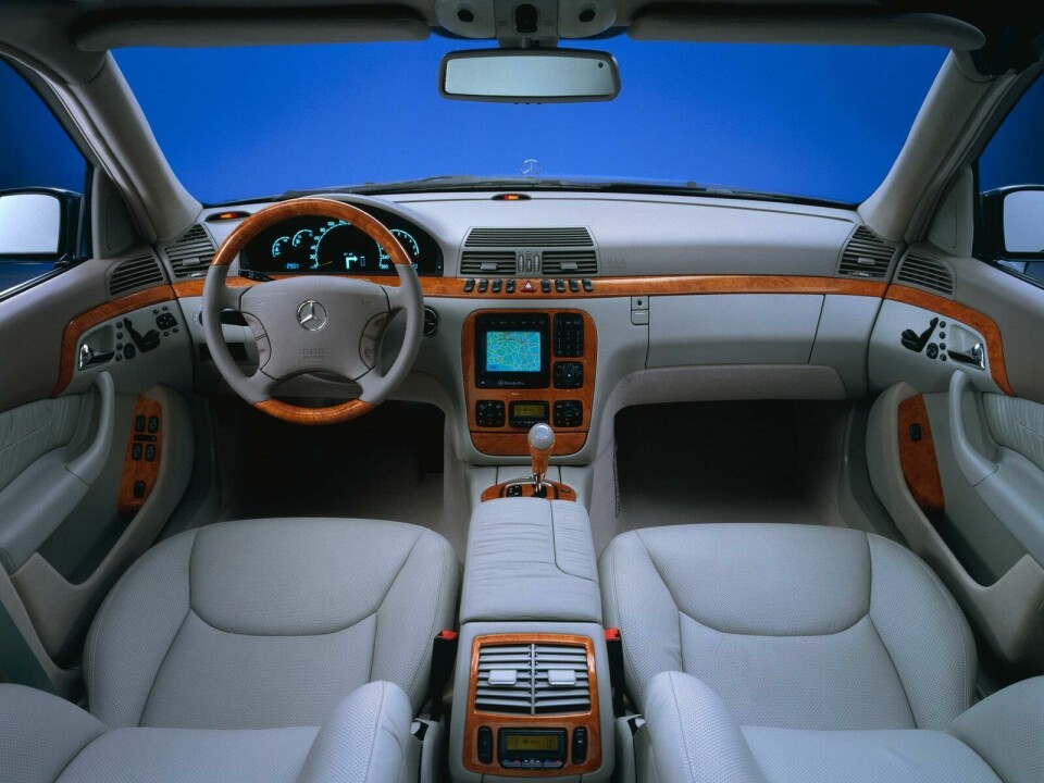
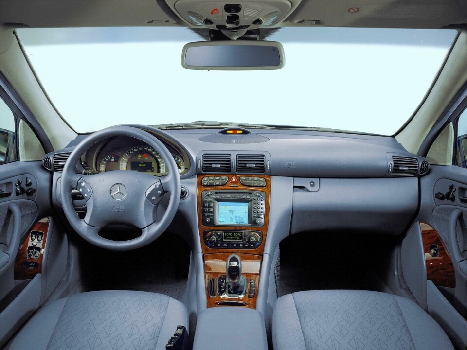
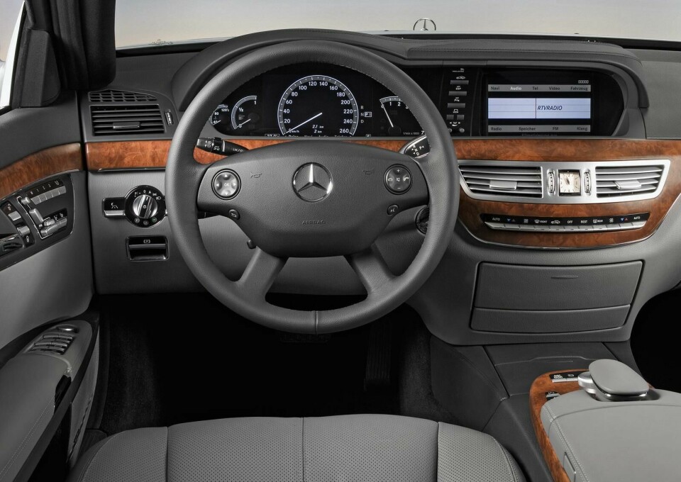
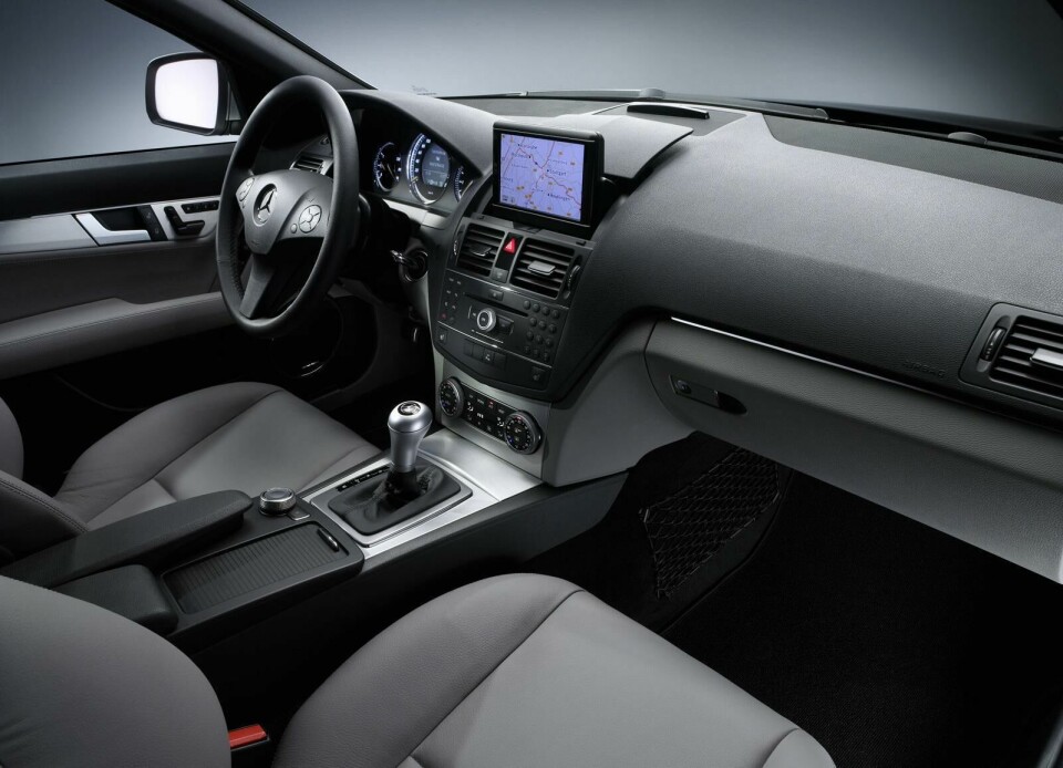
– Evolution of Mercedes-Benz dashboard screens (W220 S-Class, W203 C-Class, W221 S-Class, W204 C-Class)
Perhaps no manufacturer’s interior design charts the difficult maturation of the automotive screen better than that of Mercedes-Benz. From the small and fuzzy navigation units positioned awkwardly low on the fascias of cars like the W220 S-Class and W203 C-Class of the early 2000s, to the rather more pleasing double binnacle of the W221 ‘S’ and the neat flip-up arrangement of the pre-facelift W204 ‘C’, through to today’s tacked-on iPad arrangements; M-B has cycled through almost endless permutations in the hope that something would stick.
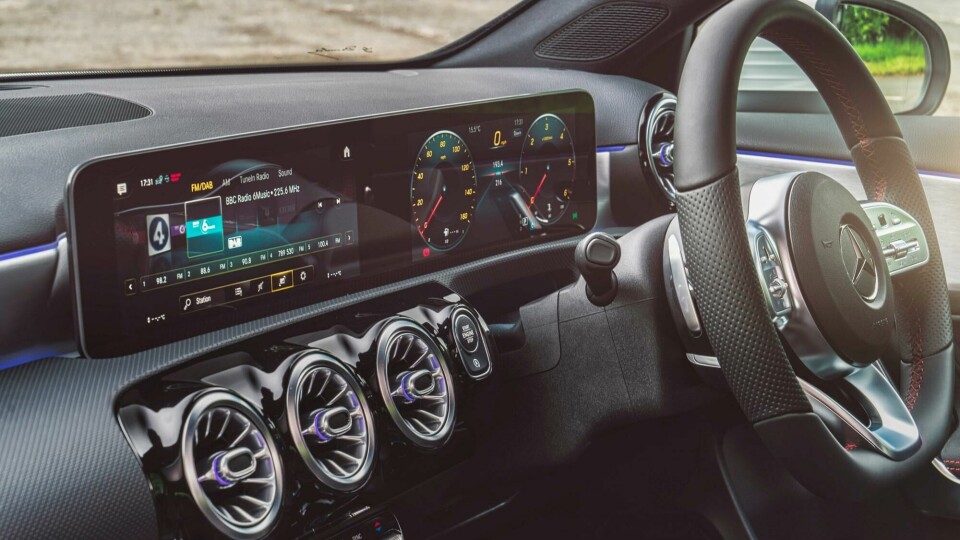
Unfortunately, though their remarkably intuitive, slick and crisp MBUX operating system is nothing if not impressive, Mercedes’ display screens themselves remain aesthetically incongruous, even downright ugly.
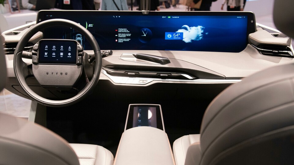
Other manufacturers are no more accomplished, with most of the ‘old guard’ (including Ford, Toyota, Renault, Skoda, Hyundai and more) seeming to favour the afterthought approach, with displays resembling cheap, supermarket-brand tablets perched atop otherwise conventional dashboards, whilst the likes of Tesla and Byton seem more concerned with size-related one-upmanship than anything else.
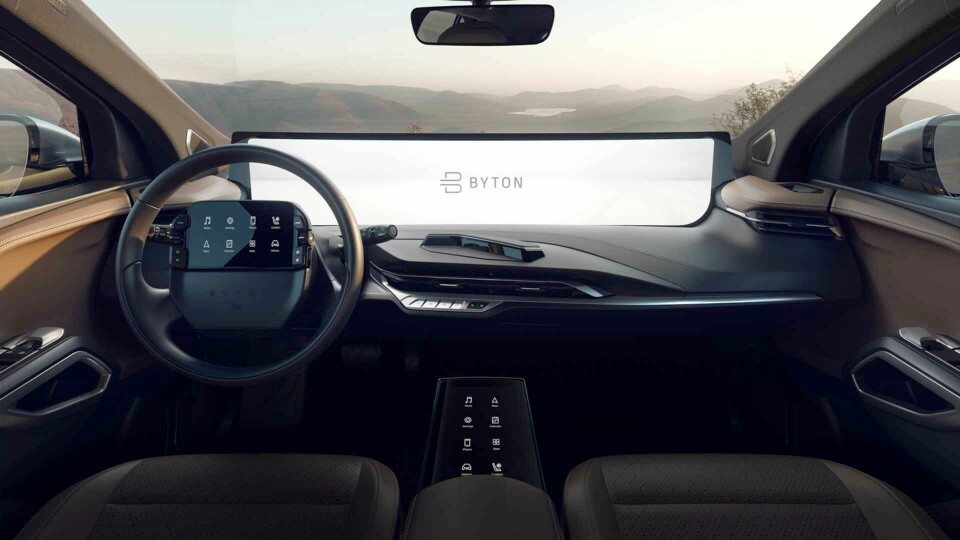
Clearly not content with a mammoth 48-incher dominating the fascia of its M-Byte, Byton added yet another screen to the steering wheel boss too. An arrangement sure to prove in-no-way distracting to drivers of this large, heavy, high-powered SUV…
Of course, it’s easy to see why screen integration has proven such a tricky task for designers. For starters, though many of modern vehicles’ functions are accessed via infotainment systems, the screens themselves must – for obvious reasons – not become the main focal point of their environment in the way that a television or PC monitor might be.
Until the advent of true autonomous vehicles at least, infotainment displays must be prominent and clear enough to provide the necessary information in exchange for minimal effort, but not so pronounced or captivating as to distract from the all-important business of, you know… actually driving the car. A tricky balance to strike for designers.
Secondly, the integration of a typically large, flat, rectangular object (as screens have invariably been until very recently) into a small, traditionally shapely and sculptural environment, such as a car interior, was always going to be a visual challenge.
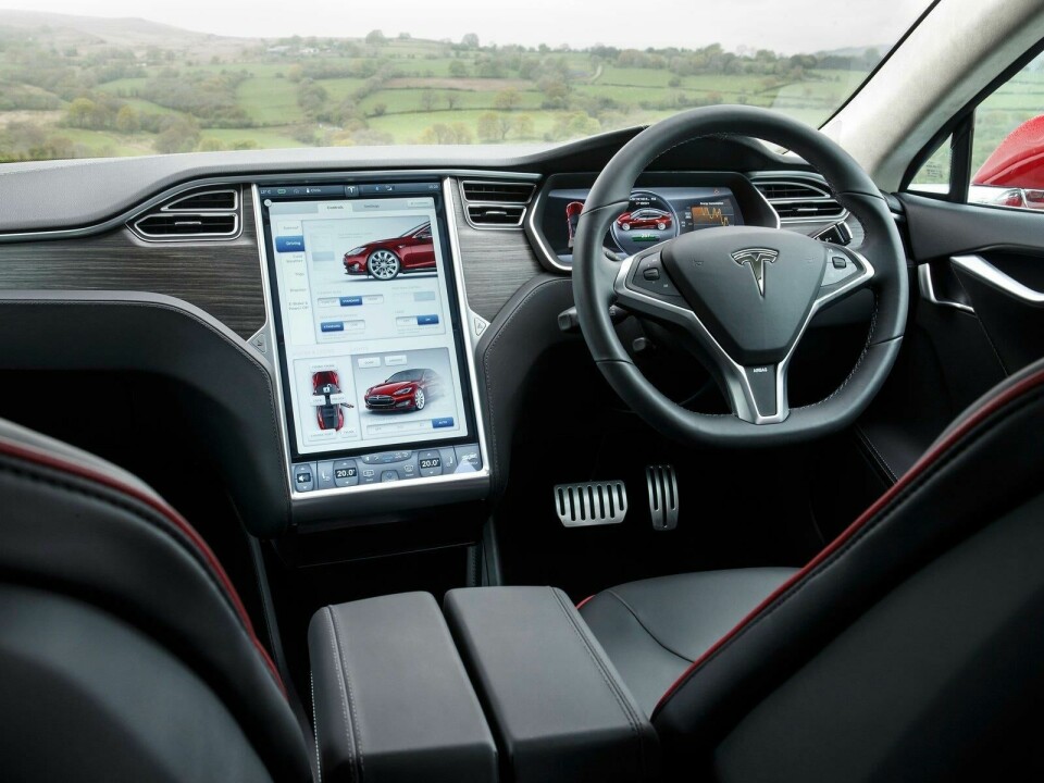
Just ask Tesla, whose decision to integrate a cinema-esque screen into the otherwise-conventional dash of its Model S left it looking aesthetically jarring and contrived – iconic though the car has become, a design classic it most certainly is not.
Just in case that wasn’t enough, there’s product lifecycles and gestational periods to consider. Clearly, a typical automotive model-cycle of five to seven years can see huge leaps in tech, thus even current-model cars can feel woefully off-the-pace in infotainment terms, and designers find themselves in the difficult position of having to second-guess future trends and developments.
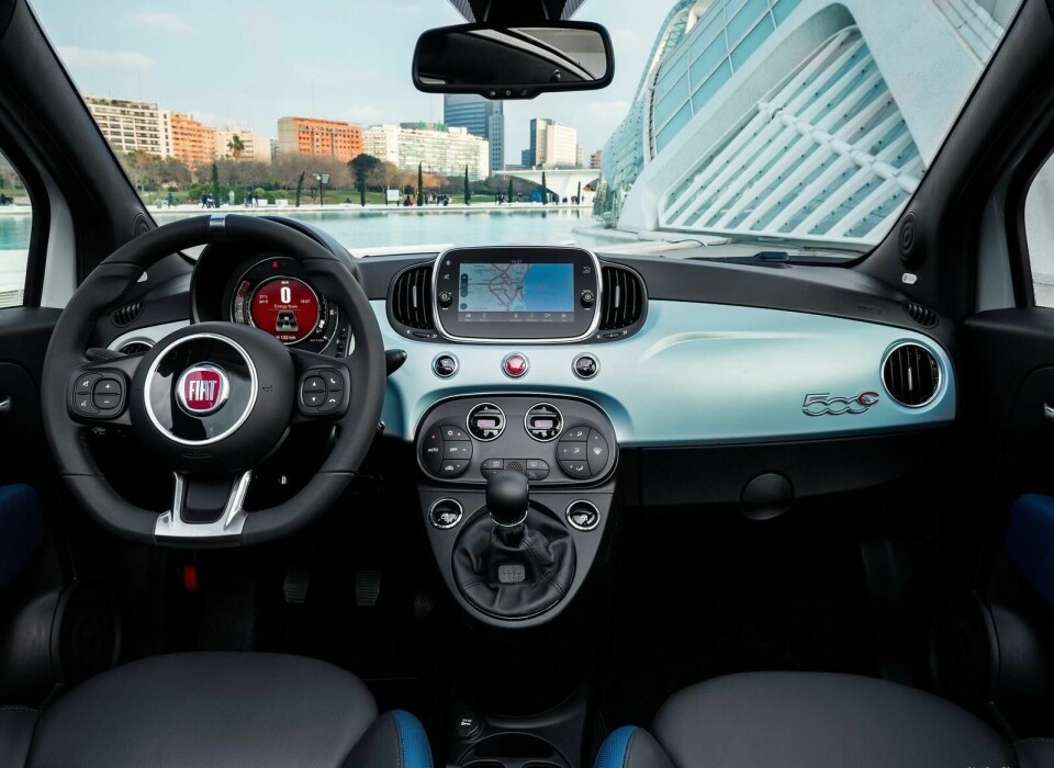
It’s perhaps this fast-paced development in the underlying technology which, more than anything else, is responsible for the awkwardness of many modern cabins. As soon as designers find elegant solutions for today’s tech, consumers and marketeers will start to demand the next new thing, meaning the design formula has to be re-jigged before the dust has even settled. It’s truly bizarre to think that Fiat’s still-current 500 was launched back in 2007, the same year as Apple’s original iPhone – basically an antique today.
Of course, while big-screen tech is still novel, merely having it is often selling point enough, even if the aesthetics are left wanting. As with all trends however, the giant leaps being made today will inevitably give way to more incremental fine-tuning as time progresses. After all, there’s only so big one can make a display within the confines of a car interior, and only so many tech-functions occupants can feasibly want or need. Once a feature becomes omnipresent, execution instead becomes the differentiator.
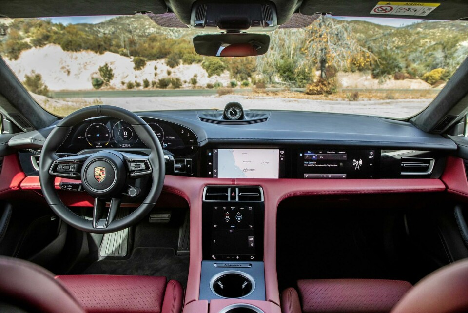
The signs are beginning to show too. The establishment’s newest and best take on the Tesla formula, Porsche’s Taycan, features a tech-heavy interior which actually looks and feels like the product of serious time, effort and consideration, rather than a rushed afterthought using off-the-shelf components (à la its arch-nemesis). The car’s myriad screens are seamlessly integrated into a more traditionally sculpted and ergonomically sound cockpit of impeccable quality.
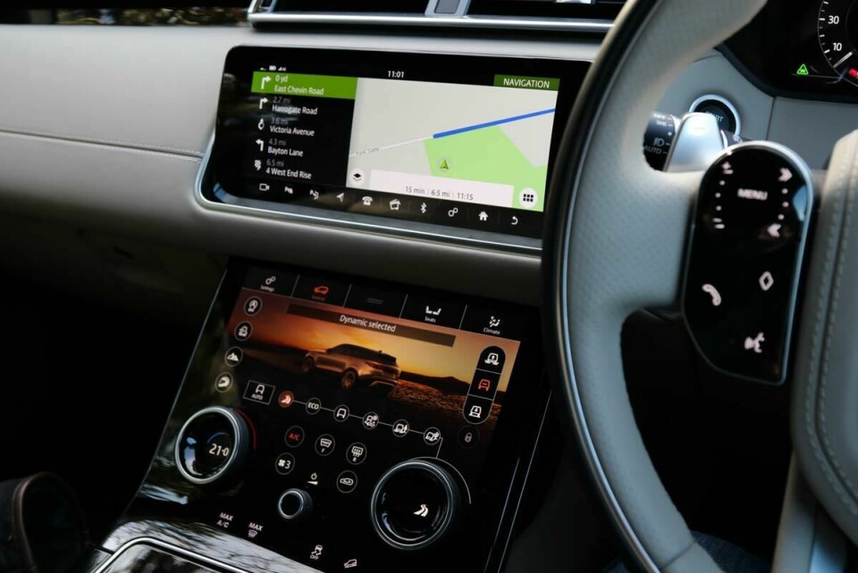
Jaguar Land Rover too has impressed. Its Touch Pro Duo system (which first appeared in the Range Rover Velar) combines super-slick touchscreens with traditional buttons and rotary dials to create a streamlined, minimalist yet intuitive and easy to use interior.
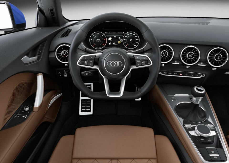
Delving a little further back, Audi’s third-generation TT of 2014 still represents one of the finest fusions of old and new worlds – even in the autumn of its life – with its highly-customisable Virtual Cockpit providing clear, crisp information immediately beneath the driver’s line of vision, plus ingenious (and beautiful) digital heater controls which utilise tech to fine-tune an already effective component.
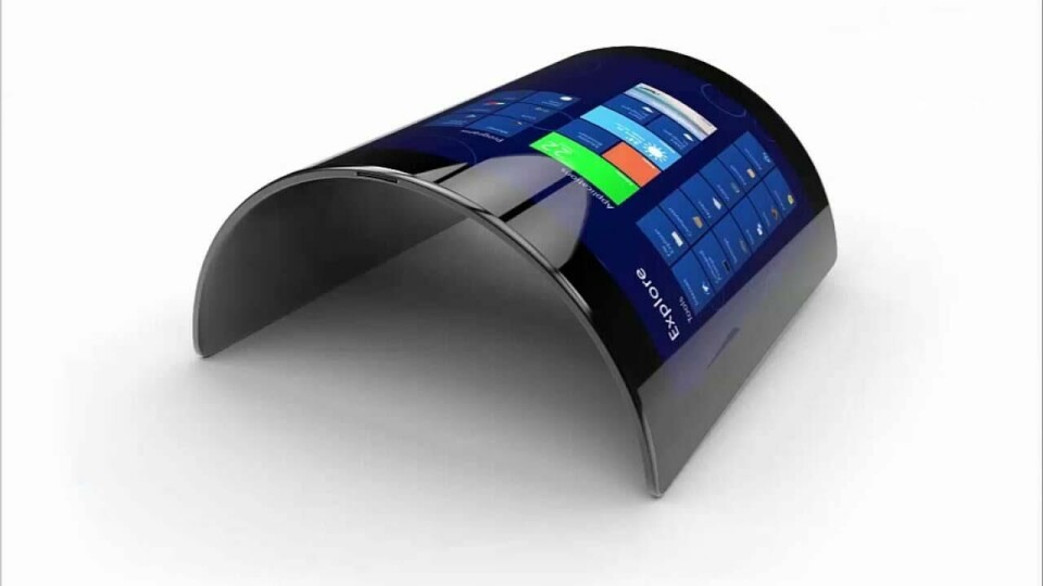
Still, impressive as these layouts are today, one day they’ll almost certainly seem as antiquated as the aforementioned Lagonda. Maybe the three-dimensional, foldable and flexible displays emerging and proliferating in other sectors will soon find their way to the automotive world too – a development which perhaps bodes well for interior designers looking to integrate tech in a more aesthetically pleasing and cohesive manner.
Alternatively, might the arrival of Amazon Alexa and her ilk in today’s cars signal a future in which verbal, as opposed to visual, communication becomes paramount? After all, many of the hottest smart-home devices (Amazon Echo, Google Home) are conspicuously screen-free.
The greater the technological possibilities become however, the more important it becomes for designers to exercise sound judgement; to distinguish that which is truly useful and purposeful from that which is gimmicky, superfluous or even downright dangerous.
As many of the aforementioned examples demonstrate, good design is not a question of what can be done, but what should be done. For though all progress requires change, not all change is progress.