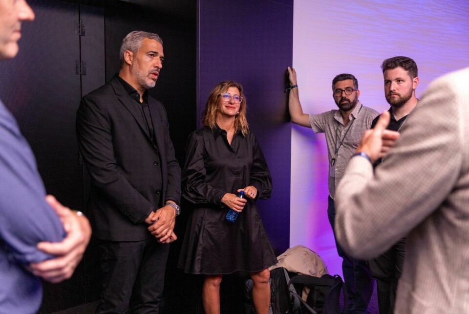
Cupra CMF lead explains matte paint, copper accent strategy
Francesca Sangalli, head of colour and trim at Cupra, explains how distinct colour themes, finishes and parametric patterns help the brand stand out
With most household brands now sitting within larger parent organisations, often using shared technology, the pressure on design to create a distinct brand-feel is high.
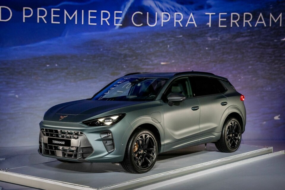
For Cupra, the performance spin-off from Seat which is in turn held within the wider Volkswagen Group, this is particularly true; launches from recent years often gain immediate comparison to models from sister brands in Audi, VW and Seat, and at the Terramar reveal, the word “Tiguan” could be heard from some members of the media. Justified or not, Cupra will have to continue finding ways to set itself apart and from our discussions with design leadership, it seems CMF is the way to do it.
“With our strategy, we focus on neutral colours that work with our copper details. This allows us to create a quite sophisticated palette,” says Francesca Sangalli, head of colour & trim concept & strategy, who joined Cupra in 2018 after nearly 17 years with Mercedes-Benz. “There is a lot of work that goes into this because Cupra and colour are closely linked.”
I really believe in finishing to deliver character beyond the colour itself
Viewed in the metal, the Terramar does not feel too closely related to the Tiguan in our opinion and design boss Jorge Diez is right to describe it as “evil” looking from some angles.
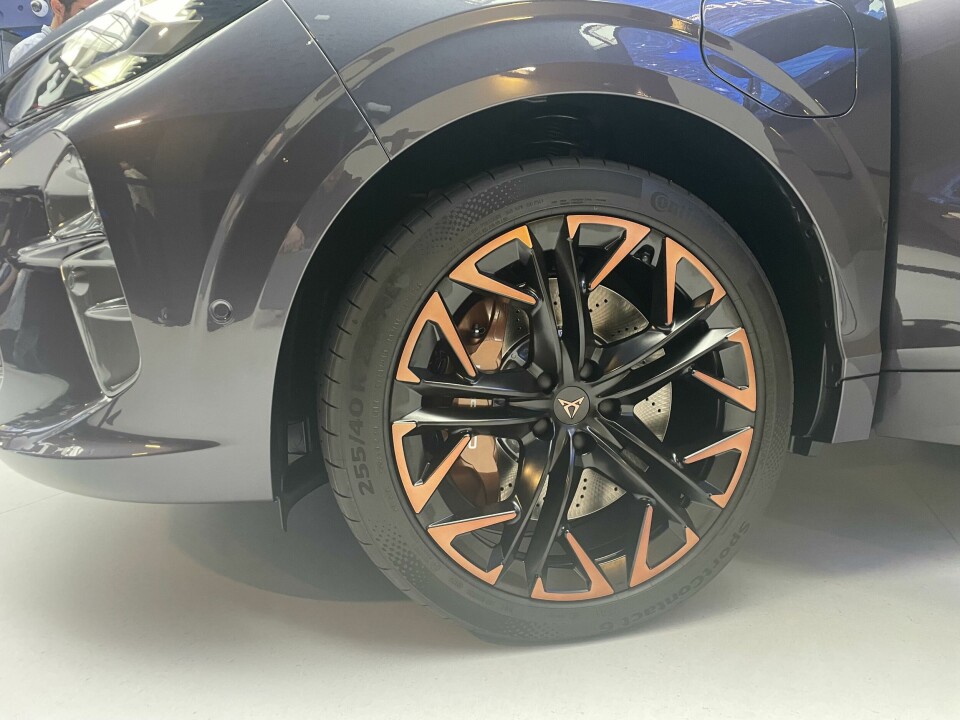
Whether bronze is your cup of tea or not, its application inside and out immediately signifies that this is a Cupra. It passes the badge removal test: cover up the logo on the bonnet or steering wheel and you’d still tell this was a Cupra. Others such as Zeekr do employ rose gold, but the application feels a little less distinctive.
These copper accents have helped to shape a particular colour theme, pairing well with earthy palettes and matte and satin finishes which Cupra employs with gusto across the range. Conventional gloss and metallics are also offered (like Dark Void below) but again in almost coastal hues of blue, green, brown and grey.
“I really believe in finishing to deliver character more than just the colour on its own,” says Sangalli from the passenger seat of the Terramar. “With a matte colour that is almost stony and very mineralised, it gives a level of rawness. In fact, raw is one of the words we use to define the essence of Cupra.”
The theme carries through to Cupra’s clothing range, too, further connecting certain colours with the brand. But it is the emphasis on finish which separates Cupra from the likes of Skoda, Seat, Audi and VW.
“There is an extra effort to deliver this sensorial effect with the finishing, going beyond the colour itself,” explains Sangalli. “And not all colours go with copper, which is why our body colour strategy is quite radical – we don’t have all the typical colours seen elsewhere on the market.”


The marriage between copper and Cupra affords the brand a degree of freedom when it comes to the ‘styling’ and architecture of the overall design, perhaps experimenting from model-to-model and avoiding a “same look, different size” approach. “It gives you the opportunity to make something that really highlights the brand,” says Sangalli.
You need to recognise that this is a Cupra
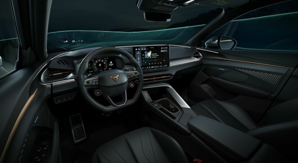
Another element that ties in with the overall feel of the brand is the triangular motif that repeats throughout the vehicle, from the light signature to the patterned finish of the centre console and IP, and the shape of the Cupra logo itself. Even the wheels. In some cases the triangle is explicit, in others more subtle, but Sangalli explains the overall strategy is to highlight key elements of the vehicle.


“We generally apply this parametric design in areas with hard surfaces or elements that feel solid, structural – skeletal almost. This gives us a guideline on how to apply the structure and detailing in a way that is harmonious, not exaggerated, while also creating a family feeling,” says Sangalli.
The triangular pattern found on the centre console and dash is particularly striking up close, almost giving the appearance of carbon fibre but not quite. Sangalli nods to the fact that carbon fibre is perhaps the de-facto material for many sporty interior trims, and Cupra needed to do something different to stand out: “We need differentiation from the carbon – you need to recognise that this is a Cupra.”
We often hear how exterior designs are increasingly influenced by the interior – readers will no doubt be familiar with the “designed from the inside out” expression. With the Cupra Terramar, Sangalli notes that this way of thinking has been taken a step further. “In fact,” she concludes, “I would say the colour and material strategy is what influenced the interior.”