
New Audi badge signals push for minimalism
The German marque has revealed its new badge, a subtle change that represents more of a significant shift toward reductionist branding
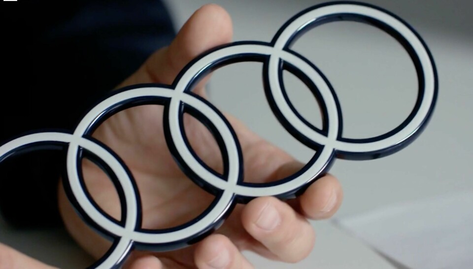
Audi has refreshed the look of its iconic ‘Four Rings’ logo. At first glance there is not a huge amount to see, you may not even tell the difference from afar. However, a closer inspection reveals the logo is now black and white – “the new chrome” according to Audi – with more of a three-dimensional silhouette.
There is a recognition that the refresh is subtle. “When you look at it, I’m pretty sure you [still] see four rings,” says Marc Lichte, head of Audi design, who describes the new badge as “discrete yet high quality.”
This is not the first time the badge has been rebranded, of course, and the team started by looking back at the brand’s history and how the badge has developed over time. The four rings first came about through a four-way joint-venture called Auto Union, which was formed in 1932 between DKW, Horch, Wanderer and Audi. Made of raw metal, the original logo had an industrial feel. In 1965, Auto Union was rebranded as Audi, removing the Auto Union logo that sat within those rings. This would prove to be the first of several steps to gradually refine and clean up the badge, which became a polished chrome.


The new badge sports white rings that ‘float’ within a black border and is almost identical in geometry to earlier iterations. There is also the option to have the rings in black, which replaces the white with a shiny dark grey. Audi says it represents “state of the art automotive design” and is more modern than before. Lichte elaborates that it is part of a broader push to become “more clear, consistent and reduced” when it comes to branding. “No line, no shape, no badge should be redundant. This means every form has a clear function. Less design is good design.”
For what is a premium brand, this represents a wider trend around reduction. New luxury is not defined by the number of shiny things inside or outside the vehicle. It is about doing the simple things well. That’s a lot to take away from a simple badge refresh, but Frederik Kalisch, a brand strategist at Audi, notes that keeping things minimal has multiple benefits. “Besides distracting from the design of our cars,” he says, “overly conspicuous identifiers probably wouldn’t go down well with our contemporary, progressive customers.”

A spokesperson for Audi told CDN that following a refinement of the brand identity around 2020, ”the next step was to consistently develop the four rings on the vehicle into a two-dimensional appearance, standardising vehicle identification across all models.” They add that the new badge should ”look the same everywhere, whether in a magazine, on your smartphone, or a billboard – and on or inside the car.”
While the carmaker does not make explicit reference to electrification, the timing does coincide with a push to go EV. In some respects, the new design is a reflection of this as there is generally less chrome at the front of modern EVs anyway. The new badge will be used on all models moving forward and can already be seen on the Audi Q8 e-tron.
“The new two-dimensional logo is not directly linked to e-mobility, as future models with combustion engines will also carry the new two-dimensional rings,” the spokesperson notes. ”But of course, it is logical to introduce such a major change on our fully electric Audi Q8 e-tron.”