Reading between the lines: how much meaning does car aesthetics really carry?
Aidan Walsh considers whether the language around car design carries the weight – and intended meaning – that it used to
As car industry jargon goes, the phrase ‘design language’ is a firm favourite. Kodo, L-Finesse, Flame Surfacing, Art & Science, Kinetic Design, Fluidic Sculpture, the rise, fall and progression of such visual philosophies has long fascinated designers and enthusiasts alike.
However, despite the popularity and longevity of the term itself, it is often tempting to view the underlying concept of form language through a somewhat sceptical, dismissive lens. Beyond marketing bumf and bluster, it’s easy to doubt whether such ‘languages’ actually tell us anything of significance. After decades of bombardment with style after style and visual terminology galore, not to mention the commodification, co-opting and cynical exploitation of once evocative cues, are we not now numb to the idea that visuals can signify genuine meaning? Does style still hold the power to excite, awe or shock us the way it once did, or is talk simply too cheap in the language of car design?
Historically of course, it would be virtually impossible to argue that aesthetic movements and styles were not capable of conveying great meaning. Undoubtedly there is, and always was, no shortage of visual white noise out there in every genre and discipline, but at the same time, the power of aesthetics to get one’s point across has been skilfully utilised by everyone from William Morris to the Bauhaus, and has epitomised everything from the decadence of Art Deco to the spitting and snarling rebellion of punk.
In the automotive sphere too, style can clearly speak to us all, often without our even noticing. At the most basic level, bluff facades and towering ground-clearance have traditionally alluded to ruggedness and go-anywhere ability, while deep air-dams and jutting spoilers have been most often associated with speed, power and performance – pretty obvious stuff. Nonetheless, when we come to the more nebulous business of design language, as opposed to individual visual elements and indicators, like a gaping vent or projecting wing, things aren’t quite so straightforward.
Looking back, it’s difficult not to see Ford’s much-vaunted New Edge movement – surely one of car design’s most memorable and influential dialects – as a sort of visual encapsulation of the post-Cold War, pre-9/11 sunlit uplands in which it spawned. With crisp contours, daring angles and swooping arcs, along with a lesser-seen clean slate approach, New Edge seemed to sum up the optimism, excitement and nagging uncertainty of the new millennium’s dawn in a way that words simply couldn’t, as if its creators somehow tapped the collective psyche of the late-1990s populace with particularly fruitful results.
Just as actual terminology is often diluted by time and misuse, the visual vocabulary of car design is similarly vulnerable
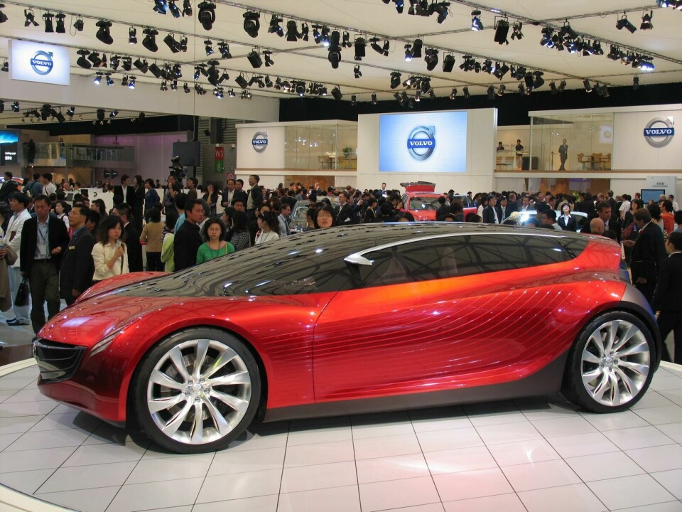
Mazda’s Nagare, by contrast, appeared to tell a more individual story, that of a quieter, oft-overshadowed brand, building an identity which was at once unmistakably Japanese, yet undeniably unique. Its flowing, ostensibly wind-sculpted forms exuded calm and serenity, the hallmarks of a brand increasingly at ease with itself. Its organic themes marking a step-change from the ‘constructed’ aesthetic typical of the time, Nagare was nothing if not impactful, establishing Mazda as the design leader it remains to this day and setting it apart from compatriot brands, such as Subaru and Mitsubishi, who have consistently struggled to establish visual identities of their own.
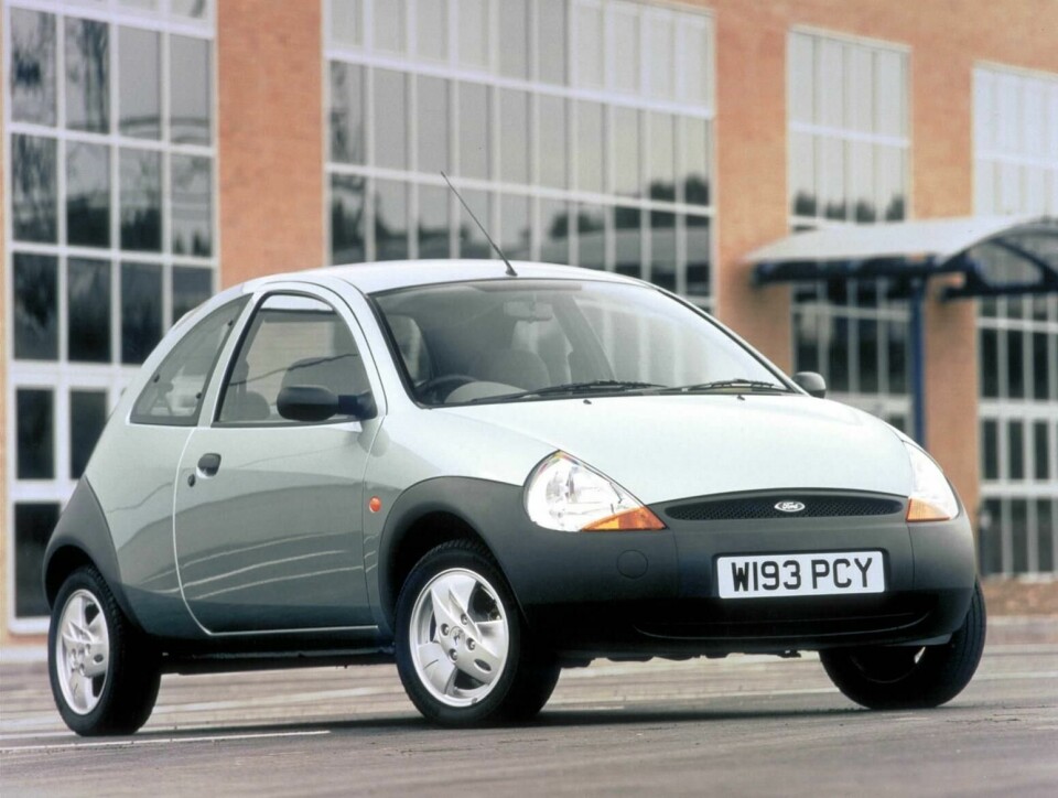
Despite its potential power however, it is important to acknowledge that, just as actual terminology is often diluted by time and misuse – see how YouTube hyperbole has diminished the word ‘destroy’ – the visual vocabulary of car design is similarly vulnerable. After all, we must acknowledge that the impact of even masterstrokes like Ford’s 1996 Ka (one of the earliest examples of New Edge) is invariably blunted by the passing years. Sure, we can view the Ka with fondness, even reverence, today, but we can’t experience the same shock, awe or revulsion we may have done back in the mid-nineties, too much water has now passed under that particular bridge.
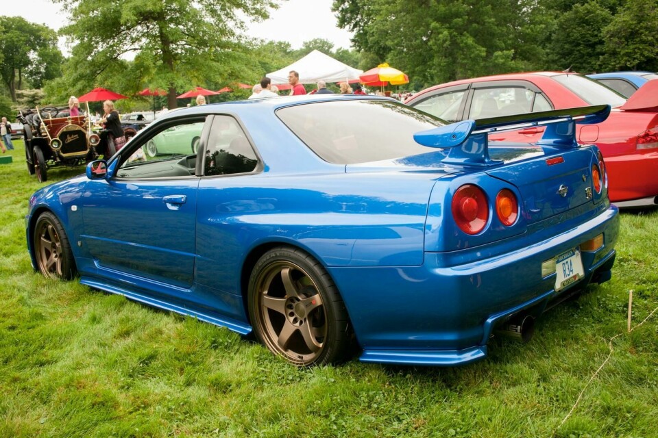
Likewise, the widespread misappropriation of commonly understood visual descriptors only weakens their effect upon the onlooker. When everything from a Kia Picanto upwards now scowls at us like an enraged tiger, we’re probably less inclined to read visual muscularity and aggression as a mark of blistering performance the way we did when cars like the R34 Nissan Skyline GT-R and Lancia Delta Integrale first emerged. Nor, when half the automotive world has imitated, incorporated, and now mostly discarded, its once-controversial iconography does Chris Bangle’s infamous Flame Surfacing still convey the deliciously avant-garde message it once did.
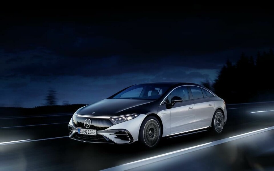
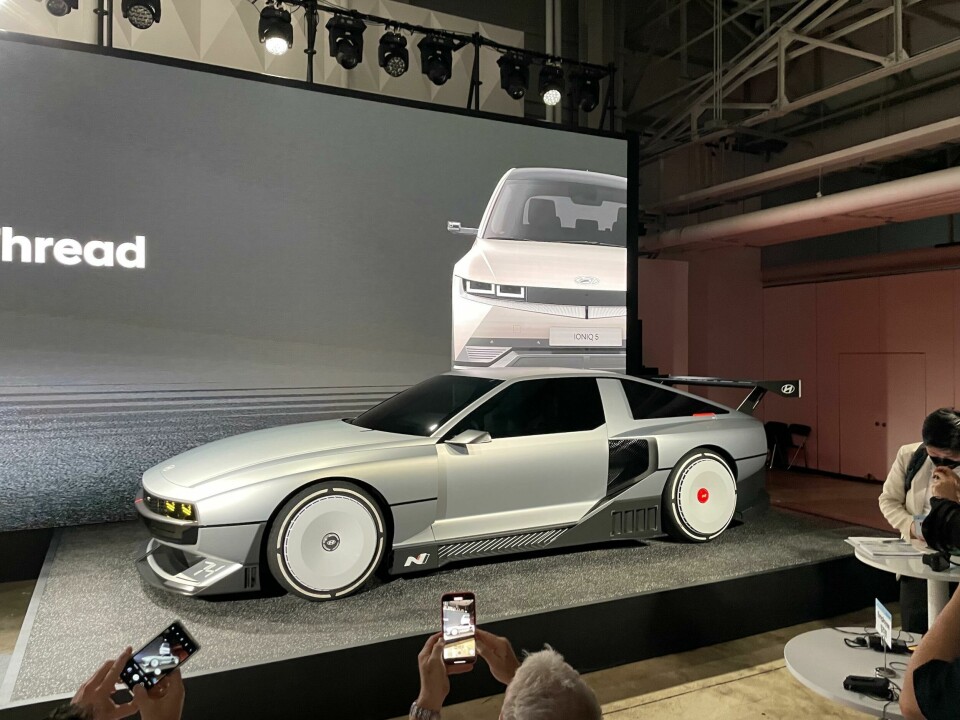
Conversely, it is perhaps the retro-futuristic vernacular of Hyundai’s N Vision 74, or the sleek, unadorned teardrop forms of the Porsche Taycan and Mercedes-Benz EQS which now spark the imaginations and whet the appetites of those seeking deeper visual stimulation. Sure these vehicles (the Hyundai in particular) can be accused of mining the past for inspiration, but the elements they do appropriate are nothing if not striking and thought-provoking in current context.
Design, like language and culture, is dynamic, ever evolving
And, just as with the written and spoken word, context in visual terms is, if not everything, then at least jolly important. Taking words out of context leaves us vulnerable to the nuances of sarcasm, irony, the ever-evolving nature of slang and plain old misunderstanding. Car design is very much the same story.
Whereas the sparse, severe forms of Dacia’s warmly-received Manifesto concept may once have spoken unambiguously of crudity, backwardness and a manufacturer lacking the means or ability to create something more visually sophisticated, to modern eyes that blocky, spartan appearance is more indicative a clean-slate approach, a thoughtful re-evaluation of what a vehicle could and should be, and a confident brand asking itself probing design questions, rather than one still struggling with the basics of its own trade.
Design, like language and culture, is dynamic, ever evolving. The words ‘bad’, ‘sick’ and ‘wicked’ meant what they meant, until they meant the opposite. Plaid shirts and voluminous facial hair were for lumberjacks, until they were for urban hipsters. ‘In yer face’ car styling was once emblematic of youthful rebellion (see The Fast & The Furious, Max Power magazine, etc.) but once OEMs jumped aboard that bandwagon in the late noughties the modders and hot-rodders started to prize the subtlety and understatement of ‘OEM+’ tuning instead.
While specifics may change and trends morph, multiply and fizzle out, appearances will always have the power to speak to us in ways that mere words alone cannot; visual design is simply too powerful a tool to not to utilise. As long as there remain dominant paradigms, cultures or orthodoxies designers will have scope to hone, bend, break, counter and defy them. As yesterday’s revolutionary becomes today’s ordinary, yesterday’s ordinary can become remarkable and meaningful once again.
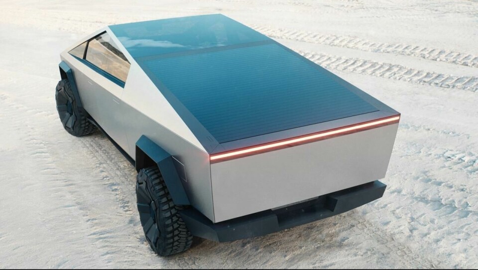
And for anyone doubting the continued ability of vehicle design to shock in a Tik-Tok, MAGA, Kardashian world, a simple two-word retort should suffice: Tesla Cybertruck.