Asymmetry: Car Design’s Great Taboo
It’s one of those unwritten rules; car exteriors are symmetrical. Why? Because… well… they just are!
Of course when we say ‘symmetrical’, we are referring to bilateral symmetry, that is to say symmetry between each side of the vehicle (rather than front and rear) with the plane running through the centre of the vehicle in the direction of travel.

Why design a whole exterior when you can design half and use a mirror?
So entrenched is the expectation of bilateral symmetry it seems, that the only time we ever stop to really question it is when presented with a obvious exception, such as the controversial tailgate treatment on Land Rover’s current Discovery or the Nissan Cube’s quirky glazing.
But just what is it that makes this the case?

Hyundai Veloster added production complication with asymmetrical doors
Clearly cost plays a role, with the additional time, effort and therefore money required to design and develop differing components for each side of a vehicle (rather than simply mirroring them across both sides), along with potential complications in terms of weight distribution and aerodynamics which may arise from significant levels of asymmetry.

Some SD1s were allegedly different lengths on each side…
There’s also the danger that asymmetrical styling could invoke notions of manufacturing incompetence, as opposed to boldness and flair. This may have been a particular concern in times gone by, when genuinely shoddy build quality was commonplace in the car industry – some Rover SD1s, for example, were rumoured to have been unintentionally asymmetrical due to poor quality control.

A symmetrical shape keeps things balanced on the move
Also, since cars (unlike buildings for instance) are dynamic objects which often travel at high speed, it therefore follows that they are expected to appear visually balanced, with bilateral symmetry being one of the easiest ways to achieve this.
As visual traits are so often taken to signify underlying functional and character traits, cars lacking visual balance are perhaps likely to be perceived as being less balanced mechanically too, thus less stable, more difficult to control on the move, less enjoyable to drive, even potentially unsafe.

Even wacky bodies tend to have normal ‘faces’
Furthermore, since we often tend to anthropomorphise our cars, their appearance, particularly their DRG or ‘face’, is often subjected to human beauty standards.
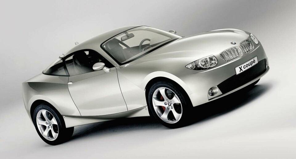
Since studies have shown that perceived facial attractiveness in humans is strongly linked with higher levels of symmetry, it’s perhaps not surprising that even those cars displaying noticeable asymmetry elsewhere in their forms, such as Chris Bangle’s notorious BMW X-Coupé, still display conventional ‘faces’ – anything else might risk violating some of our most deeply held human instincts.

Many cars use asymmetry subtly, such as the Peugeot 206’s bonnet vents
But does all this mean asymmetry is a design dead-end? Not necessarily. First off, it’s important to acknowledge that actually, many cars (the vast majority even, if one is being pedantic) do display external asymmetry, just in relatively minor details – the Citroën SM, Peugeot 206 and Audi Sport Quattro come to mind amongst numerous others.
Why then, are we largely OK with these?

The M3 CSL’s lone air intake – like a pretty little mole on a model
To continue the human analogy, perhaps things like offset badges, vents or rear fog lamps are most akin to small items of jewellery or ‘beauty marks’, in that they are not necessarily expected to appear in a symmetrical pattern and may even serve to add ‘character’ by not doing so.
By the same token, non-symmetrical graphics or decals, like those seen on the Audi R8 RWS for example, don’t seem to be an issue either – perhaps these could be likened to tattoos.

Even offset details in a vehicle’s ‘face’ can gain acceptance; see the BMW M3 CSL’s single circular vent or the Alfa Romeo 156’s registration plate positioning, providing they are in fact details and don’t register as part of the car’s main ‘facial features’ i.e. eyes, nose or mouth.
Extending the human parallels even further, it is striking that while we’re supposedly hung up on symmetry when it comes to facial features – let alone major body parts, limbs, bone structure, musculature and so on – we seem less concerned when it comes to more ‘superficial’ things like hairstyles and clothing.

Ed Roth’s ‘Orbitron’ - perhaps an acquired taste…
Many are happy to wear double breasted (or otherwise non-symmetrical) garments, side partings or even an asymmetrical bob without fear of ruining their underlying good looks. It does seem that, so long as the main ‘structural elements’ have strong symmetry, the decorative ‘surface dressing’ can be more daring. Might this quirk be a key to some of the more ‘out there’, but successful, applications of asymmetry in the car world?

BMW’s Mille Miglia tribute went further than the ’30s original
BMW’s stunning 2006 Mille Miglia concept featured a bold surface treatment to the rear which actually brings to mind flowing sheets of fabric (a dress or coat tails) trailing in the car’s wake, clearly not symmetrical, but certainly effective when combined with fundamentally sound proportions.
Likewise the audacious asymmetrical windscreen which extends deep into the bonnet of the marque’s 2011 Vision ConnectedDrive concept (see gallery) – a feature comparable to a plunging asymmetrical neckline, perhaps?

Sportscar racers used to cover the passenger seat area for streamlining purposes. The D-Type went further, with a fin
Even the 1950s Jaguar D-Type, oft-regarded as a great beauty despite its unconventional appearance, could perhaps tie in with this.
As with the two BMWs, the D-Type has a largely conventional face (although some versions gained an odd third headlamp), and exhibits otherwise perfect symmetry in its lower body and haunches (limbs/musculature), with only the lightweight, almost superficial-looking windscreen and rear fin failing to conform, like a ‘Skrillex haircut’ on a supermodel.
Something else which links these three cars – beyond the fact that they all nailed the ‘basics’ (proportions, stance, ‘face’) before exploring unconventional surfacing – is that where they do employ asymmetry, they do so with absolute conviction.

New Discovery got asymmetry wrong, unlike its predeessors
This is perhaps where the much-maligned current Discovery, and maybe even the Nissan Cube ultimately fall down. In Land Rover’s case, the latest Discovery’s tailgate, in stark contrast to earlier generations, is simply not executed resolutely enough to avoid looking like a mistake or afterthought, since its plate recess is neither ‘dead centre’ nor significantly offset, and doesn’t tie in with the car’s rear window shape either.

The latest Cube isn’t so big and clever either
Even the Nissan, which may initially appear bold, relies on nothing more than a single blacked-out pillar to create asymmetry, which on reflection is a little half-hearted.
The fact that neither car can boast the intrinsically attractive proportions of the aforementioned D-Type, Alfa Romeo 156 or even the Discovery 3 doesn’t help either, nor does the fact that neither can claim any real functional purpose for their asymmetry and thus posing the question; if it is neither beautiful nor useful, why is it there?

Perhaps Land Rover should learn from their own past
With all this in mind, might asymmetry ever become more than a shock tactic amongst car designers? Although its use is clearly fraught with pitfalls, cars like the BMW Mille Miglia and Land Rover Discovery 3 show that, if executed with the necessary caution and skill, it can create very compelling results.
In this fast-moving age of hyper competition between manufacturers, taking the right design risks could be one way to provide that all important edge in the marketplace and add bit of spice to an otherwise ‘by the book’ composition.
After all, even unwritten rules were made to be broken…