Design Essay: Simplicity versus Complexity
Today’s cars often seem cluttered compared to the clean designs of the past. Is there virtue in simplicity, or does complexity have its place?
The Rolls-Royce website currently quotes Giles Taylor, director of design, on the beauty of simplicity: “The most successful designs always come down to three or four lines,” he notes.
The words are used to promote the Ghost limousine but it seems Taylor might have had the Wraith coupé in mind, given that the same quote cropped up in a 2013 press release about the two-door fastback. The release was accompanied by a four-line sketch to underline the point.
It’s hard to argue with the sentiment. A strong concept, simply expressed, can be a powerful thing.

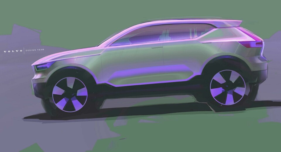
Robin Page, senior vice president of design at Volvo, made a similar observation more recently while describing the XC40’s development to CDN: “What I try to get into the guys is: how do you describe the character of your design in just three lines?”
“When I first arrived, it was very obvious that their approach was to do lots of details in the sketch. But the thing with Scandinavian design is that it’s about stripping that all away and getting back to a theme.”

Plenty of iconic designs seem to fit the three-stroke formula: the character of the original Beetle, E-Type, 911, Range Rover, Golf, or TT can be conveyed quite accurately with just a few well-chosen lines. Early examples of these cars all featured strong forms with little ornamentation.
It’s equally easy to think of appealing designs ruined by subsequent adornment, where details distract from the underlying shape.

The E-Type V12 springs to mind with its nose plastered in chrome clutter. Questionable decoration remains commonplace in today’s designs, with fake vents and faux exhausts the most common culprits. The illogical door vents of the current Range Rover (see gallery) seem particularly odd when finished in contrast colour.

However, it’s equally true to observe that stripped-back designs aren’t always successful. Three or four lines are probably plenty to describe the exterior design of Nissan’s fourth-generation Micra, for example. In that case, an admirable lack of clutter couldn’t save a weak basic theme.
Marc Newson’s Ford 021C concept featured an exterior so simple you might sketch it with two lines, dividing opinions on its debut in 1999. Some loved it, others yawned. Today it is broadly accepted as a milestone in automotive minimalism, but visual simplicity is not the concept’s only virtue: Newson also gave the car strong basic proportions.

The ratio of glass to body, the wheelbase and overhangs, wheel size and ride height, all combine to produce a sense of rightness in a design, or a lack thereof. An absence of basic balance can only be addressed through optical trickery – distractions from the actual form.
The fewer the tricks, the better the underlying proportions have to be for the design to look good, and those proportions are rarely under the designer’s full control.

Ford’s Focus hatchback provides an interesting example. The 1998 “New Edge” original was a complex design with exaggerated arches, oddly terminated curves, contrasting rubbing strips and stark triangular lamps. The surface treatment created bags of visual interest, helping to sell what was an unusually tall package at the time.

The second-generation Focus of 2004, by contrast, was more measured in style with significantly less surface distraction. It had all the impact of a damp sponge. Stripped of diversions, the eye readily perceived the second Focus as a bland box with awkward proportions.

Unsurprisingly, Ford swiftly concocted a lifecycle impulse that was less facelift than kick up the backside. The Focus 2.5 of 2007 received not just a tweaked nose but fresh pressings for every panel bar the roof, featuring an array of new kinks, corners and creases. The restyled exterior created a more visually complex car that looked all the better for it.

Another area where complexity works well is in the suggestion of sporting prowess. Lancia’s Delta looked fabulous in Integrale guise, with a host of functional add-ons. The current Honda Civic Type-R wears its stuck-on decorations (which Honda asserts all have aerodynamic benefits) somewhat less persuasively – but its brash persona reminds us that not every demographic is looking for elegant simplicity.

Similarly, tastes change with the times. In the 1980s, the appeal of a record player was roughly proportional to the number of buttons and lights on its control panel, and cluttered cars were equally welcome.
Porsche 911s of the period wore thick rubber strips, bumper concertinas, black plastic arch guards, ostentatious whale tails and contrasting side graphics, and still managed to look pretty cool – as did the contemporary Countach, with aero skirts, swollen intakes and a rear wing the size of a table for two.

Today, a busy mix of surface features can still come together into a pleasing whole. The strong-selling Toyota C-HR is a good example, with its exuberant creases, cuts and cladding helping to disguise a slab-sided vehicle with a substantial front overhang.
The equally busy current Prius isn’t nearly so well resolved, however, making the iconic second generation of Toyota’s hybrid seem wise in its restraint.

One further pitfall that stripped-back designs might tumble into is excessive cuteness. The risk is typified by Google’s Firefly, the koala-faced autonomous pod. The purity of its parabolas didn’t stop it looking like an upturned potty.
David Ancona, head of Geely’s Barcelona studio and designer of the new London taxi, voices a similar thought about the outgoing TX1 generation of black cabs. “It’s like a taxi that’s been done for Wallace & Gromit,” he says. “It’s a bit over inflated, a bit like a hedgehog.”

The traditional London taxi has always had an uncluttered design that distils down to a few key lines: an upright grille, a long roof that curves softly over the rear header, a bustle boot and a kinked haunch over the rear wheel. But the execution of those elements can create very different kinds of character.

As noted by Max Missoni, vice president of exterior design at Volvo, it’s hard to hang onto a simple theme throughout the design lifecycle. “There are so many forces that push and pull on your initial idea,” he says. “Sometimes, you’re tired, you want to go home; it’s easy to say, ‘You know what? It’s fine.’ That’s one moment in thousands of those, and the sum of those [can ruin the design].
“Making a beautiful sketch is the easy part. You don’t put it in the post to engineering.”

Returning to Rolls-Royce, the recent bespoke Sweptail coupé might be instructive. It’s based on a strong theme that looks fabulous in sketches, but seems disappointingly leaden once transformed into an actual car, with noticeably worsened proportions.
So perhaps we should modify the opening argument of this article and observe that the best designs come down to three or four lines, plus solid underlying proportions, and a tenacious translation from vision to reality.