Design Review: Citroën C3
A deep design dive into the quirky French supermini
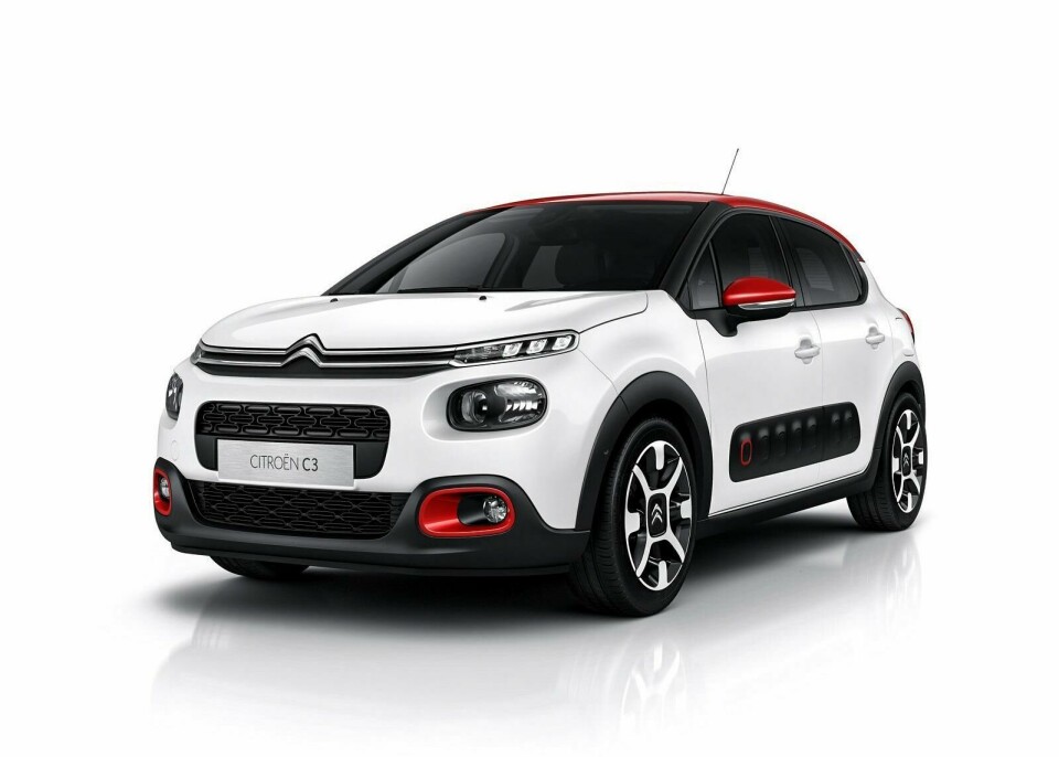
Launched at the 2016 Paris motor show, the new Citroën C3 is the third generation of a nameplate which has sold over 3.6 million units since 2002.
Picking up on the Cactus’s distinct and successful aesthetic playbook, the C3 ushers in a return to some of Citroën’s core values in the small car market: distinct individuality, and a focus on comfort and occupant wellness over dynamics. Respectively, it takes a different approach to many of the mainstream players in this B segment (still Europe’s largest by volume of sales) by adopting a quasi-crossover aesthetic.
The third vehicle to be launched in Citroën’s new design wave, it is a significant direction change after an era of relatively dull and indistinct cars when the brand was focusing on the development of DS. It shows Citroën in a confident mood — once again not afraid to stand out from the crowd and have a distinctive appeal.
Side view
1. Drawing Down
Clever drawing down of the colour accent from the roof into the details such as the first Airbump and lower fascia details creates a cohesive look in what is otherwise a very ‘elemental’ overall theme.
2. Grown up bluff
Bluff, high nose and lack of dive to the hood line is a clever move — it sets up a two-box proportion which is mature and sophisticated. The high nose also gives the C3 some of its crossover qualities.
3. Experimenting with Airbump
The Cactus’s Airbump panel becomes a thick rocker detail on C3. Its positioning means it is not as aesthetically challenging as on the larger car and allows Citroën to delete Airbumps on lower trim levels. With no Airbumps, the car has a very nude look; a clever prompt, to get customers to up-spend?
4. Visual separation…
Cabin is graphically separated. The elements — a contrast roof, running of the body colour into a thick C-pillar and a blacked-out A-pillar — pull the cabin backward, cheating the proportions. These design elements also connect C3 to premium small cars like Mini and DS3.
5. … but push in for protection
Yet while graphically separated, the cabin looks visually protected because it appears to ‘push in’ to the body side. The colour upturn at the A-pillar base, mirror sail, and the C-pillar all ‘cradle’ the window graphic, planting the C3 and giving it strength.
6. No diving
There is negligible dive in the body side — in fact, the C3’s profile is the anti-dynamic to Fiesta’s over-dynamic. This works with the detail and surfacing approach to create more of a strong, static product-feel.

Front three-quarter view
1. Way up high
Bold frontal graphics, with relatively high fascia-to-hood intersection. The high positioning of the strip lamp and double chevron integrated graphic is clever, giving the C3 strong road presence.
2. Graphic break
The DRG’s proportions are cleverly slimmed because of this deep lower clad section and air intake — its section provides relief in what could otherwise be an ungainly, monolithic front aspect.
3. Island nation
Island graphics such as the main driving lamp and grille are allowed to sing as individual design elements, neatly recessed into a very voluminous, uninterrupted surface.
4. ‘Squircling’ the square
The lozenge air bump theme of the Cactus morphs into a squircle on the C3, and is taken up as a theme across exterior details and interior.
5. Platform disguise
Sitting on the old PF1 platform, the C3 has to contend with a comparatively high scuttle. The Hood treatment — which steps down into the body side surface below the DLO, and the hood cut line on the side of the fender — are smartly executed because they distract from a packaging constraint that could have have created an ungainly appearance.

Rear three-quarter view
1. How low can you go?
Four centimetres lower than the outgoing C3 and with a much shallower glass house, the new car looks less top-heavy, lighter, longer — and avoids the MPV glasshouse that afflicted previous C3.
2. Bump up
These upturns in the cladding at the rear mimic the front design, creating a slight crossover feel to the C3’s rear aspect. A unique and unusual aesthetic.
3. Rear brand graphic
The rear lamp graphic follows the DS3 and Picasso. Like Renault, Citroën is working hard on creating a strong family-look rear graphic and these lamps are a core part of that approach.
4. Tavares special
Wheel design here is same as the C4 Cactus. Parts sharing across the C3 with other Citroën models is high — a key part of CEO Tavares’ cost-saving strategy at PSA. However, the family look it creates works well.
5. Muscling in
Subtle (it’s hard to see in white) but surprisingly pronounced section on the shoulder at the base of the C-pillar helps to create a muscular robustness to the body section and slim the rear cabin. The clad below emphasises the size of the wheels, too.

Interior view
1. Cliff-like
For a new design the C3 features a very high IP — emphasised by this cross-car lozenge graphic which wraps in the air-vents and break out. As a trend, IPs are reducing in volume — this is one of the give-aways of the older platform sitting underneath this car.
2. Fabric panel
Personalisation approach of the exterior continues inside. The highlight is this material deco panel, which keys with the seat fabric, door trim and — where leather is used — the steering wheel.
3. Cactus doors
Door cards closely relate to the Cactus, with the leather strap door pulls helping distract slightly from the very cheap, dominant hard plastic of the primary material
4. Whither UI?
PSA’s ubiquitous seven-inch touchscreen makes an appearance here, standing proud on the slim button bar used in the Cactus. On-screen graphics get a refresh, but the fundamental usability of functions such as HVAC is worse than they would have been with haptic knobs and buttons — more cost saving.
5. Trim up
Citroën’s colour and trim team are on a roll, and options such as this striped, seat face material are one of the stand-out qualities of the C3.
Verdict
Despite sales success, the previous two incarnations of the C3 have never stood out as cars which — either from a design or customers’ desire perspective — were near the top of their sector.
But after years of trying to reference its back catalogue in the design of cars this size, Citroën has now successfully managed to create something that feels uniquely of its brand, yet its own — very modern — design. To do so using the old (albeit modified) platform makes the C3’s design all the more impressive.
While eschewing the youthful, dynamic profile of Fiesta and Clio might have risks, in the B-sector, the new C3 gains an unusual maturity that comes from its four-square stance, flat shoulder, bold front graphic and cohesive detailing. That feels very of its time.
The risk is that it appeals to neither those looking for youthful, fun products, nor those after the premium brand offerings available for temptingly little extra. Citroën will hope instead the C3 mixes the best elements of both worlds, hitting the sweet spot in a rapidly changing, diverse European small car market.
At the very least, they’ve created something distinctive which — like the Cactus it aesthetically relates to — very comfortably wears its double chevron badge, and is illustrative of a Citroën brand that has a new-found confidence and clarity about what it stands for today.