Interview: Lynk & Co design president Stefan Rosen on creating the ‘anti-Volvo’
In light of the launch of Lynk & Co’s 08, Car Design News spoke to design president Stefan Rosen on how the brand’s design language has evolved
As one of Geely’s more youthful and, dare we say it, hipster brands, Lynk & Co has aimed to stand out via a combination of edgy design, technology and quirky appeal.
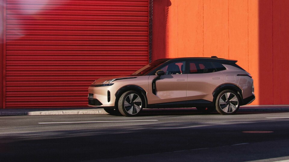
The new 08 SUV reflects this forward-thinking in the form of a mid-size plug-in hybrid, designed to feel more refined and premium without losing the irreverance that’s become Lynk & Co’s calling card. Frameless doors, dynamic surfacing and a strong lighting signature orginating from the ’Next Day’ design language (discussed in the interview) make for a slick looking vehicle.
What’s more, the 08 blends Nordic restraint with Chinese innovation in a harmonious way. The car has an athletic stance with a thoughtfully sculpted body and inside, a central screen anchors the cabin but is balanced with soft-touch textiles and ambient lighting.
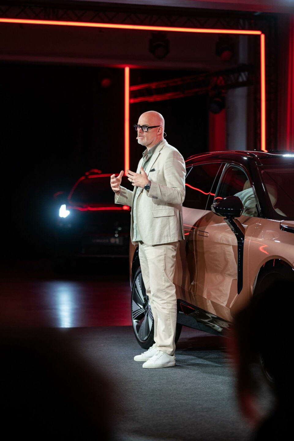
To understand how the Lynk & Co team struck this balance, Car Design News spoke with Stefan Rosen, the brand’s design director. He unpacked the thinking behind the 08’s shift in tone, from the mega-city-inspired light signatures to a more expressive exterior – and shares how the brand plans to keep evolving.
Car Design News: How has Lynk & Co’s design evolved and how is this different from Volvo’s?
Stefan Rosen: I spent 18 years at Volvo before I came here, I knew that company inside out. But here we’re talking about putting another brand on the market which shares the technology, architecture, drivetrain and could even share some of the safety. How do we now differentiate our car?
I said, let’s make it hard for ourselves. I told the team: imagine we’re finished with this car. What happens is that we sell it at the Volvo dealer and they [the Volvo and Lynk & Co models] are standing next to each other – with maybe even the same sticker price. How do we make sure you don’t steal customers from Volvo? How do you attract new customers who would never walk into a Volvo dealership?
We realised we almost needed to stay as far away from Volvo as we could. We said, what is Volvo? Let’s do the opposite. Let’s do the anti-Volvo.
We thought of nighttime in downtown New York, and asked the question of what happens when the sun sets in the city? Well, all the artificial lights come on and the windows light up in the houses and skyscrapers. This is our inspiration.
[With the 08] you can see the blocks in the tail lamps, which resemble lit windows at night on a skyscraper (right, image three below carousel).
We call this mega city contrast – which was also the name of our form language at the time. Then, in 2020, I was given a task by top management to create a new form language.
I think Lynk & Co is such a strong brand and has a strong identity I didn’t want to throw that away, but we were happy to renew it.
So, to bring something new to the already existing identity I made the analogy of what happens if you let the clock tick a few more hours after a night out and you see the first rays of the sunrise, what have you entered? The next day – which is the name of our new form language.
CDN: Talk us through some of the key design choices with the 08 – is anything changing for the European version?
SR: I wanted every section of the 08 to be different.
On the body, you can see the lines are rising and tapering – there’s movement everywhere. I also didn’t want to have any drag sections. Overall, the exterior has an organic flavour to it.
But when it came to the lighting, we went quite precise and sharp, which provides a nice contrast and twist.
We’re having a slightly different front bumper on the production car in Europe [compared to the China edition] – and I’m really happy with it. Whenever we design a car, I want it to have global appeal and not to be too narrow-minded.


CDN: And what about the interior?
SR: We kept the first-class experience in mind – a high-end travel experience. We have a sinuous shape and soft plush material but then you have very sharp detailing like this spaceship area that sits on top of the dashboard (right, image four on carousel). We could have blended it in, but we deliberately chose not to, to have a contrast.
I like to think about the interior like you would a living room. You have your sofa which is plush, but you also have a flat-screen TV and sound bar which is highly technical and sharp. We wanted to mimic that.
We’ll continue to evolve our identity… Every car will look different
We wanted the steering wheel to look like a game console from a PlayStation (left, image four on carousel) as we are looking at attracting the younger generation so we wanted to incorporate something they are familiar with and will appreciate.
We see a lot of car companies trying to blend technology and soft interior details into one design and we deliberately said no.
CDN: And what can you tell us about Lynk & Co’s future plans?
SR: If you look at Lynk & Co’s portfolio, the vehicles do not look the same. We don’t just do the same design in different sizes. We learn from every car and listen to our customers to bring their ideas to life.
What you will see is a continued evolution. We will not stop. We have a strong identity and we’re going to continue to evolve it. Every car we do will look different and we’re pushing this idea forward. Practice makes perfect, as they say.