The evolution of logo design
Suzuki reveals new emblem after 22 years

Published

Suzuki Motor Corporation has redesigned the emblem for the first time in 22 years to reflect the digital age
The new emblem retains the ‘S’ shape but adopts a flat design that the brand describes as more ‘suitable for the digital age’.
The traditional chrome plating has been swapped out for high-brightness silver paint in order to ‘reduce environmental impact’ and ‘express a shift toward a new era’.
The redesign also brings to light a new tagline for the brand – ‘By Your Side’.
Concept models at the Japan Mobility Show 2025 (31 October - 9 November) will be the first to adopt the new emblem.
Advertisement
Suzuki president and representative director Toshihiro Suzuki commeted: “The new emblem embodies Suzuki's long-held commitment to create valuable products by focusing on the customer, as well as our determination to take on new challenges for the future.
“Under the corporate slogan ‘By Your Side,’ we will continue to walk alongside our customers by providing infrastructure mobility closely connected with people’s lives, contributing to the realisation of a sustainable future.”
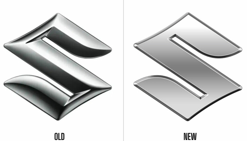
Comparison – what’s changed?
The previous three-dimensional chrome emblem has been mattified, but there is still a hint of dimension thanks to the ridge around the edge as well as the added shine on the corners. Yet, the new emblem does lack the energetic and muscular appearance that the previous emblem possessed, which could potentially point towards a shifting design language for Suzuki.
As for lighting, the lack of contrast makes the light appears more evenly spread on the refreshed emblem, which reduces dramatic contrast and gives it a calmer feel.
The negative space in the partially enclosed area within the letterform remains angular and the concave curve on the top left and bottom right edges also stays the same as the original emblem.
Overall, the proportions of the ‘S’ remain the same, in order to ensure recognisability across both designs. It’s clear that Suzuki didn’t want to stray too far from a logo that has been present for almost a quarter of a century.

History of the Suzuki logo
Advertisement
First introduced in 1954, the stylised ‘S’ logo design was chosen from a pool of more than 300 student candidates from art universities.
The winner, Mr. Masamichi Tezeni, who was studying at the Tokyo University of the Arts at the time, later became a prolific industrial designer – for example, he was involved in the design of the Shinkansen bullet train 300 series.
This logo featured a modified form of the classic Helvetica font and was coloured in a striking red and blue. Red – to symbolise passion, integrity and determination and blue to stand for class, strength and brilliance.
Now, in 2025, the evolution of the Suzuki logo retains the charm of the original design yet is nicely adapted to the digital age.
What do you think? Let us know by reaching out to us on our social platforms linked below.
Advertisement