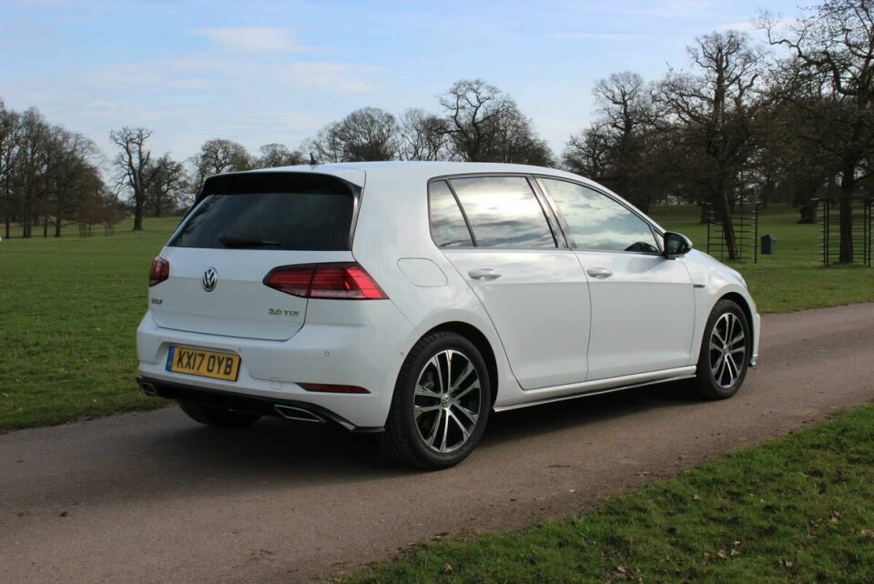
Driven: Volkswagen Golf VII (facelift)
More screens and gesture control available, but is more necessarily better? We test the VW Golf VII HMI options
The recently facelifted Volkswagen Golf is revolutionary in neither exterior or interior design. This should come as a surprise to no one. The most significant updates are centred around in-car technology instead, so with this becoming such a key part of the design, we’ve been exploring what the new car brings to the table.
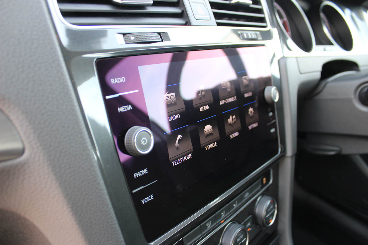
Volkswagen is very much a touch-interface company and the new cars get a significant upgrade. All European Golfs now feature an eight-inch centre touchscreen as standard, with both ‘Active Info Display’ (VW’s 12-inch virtual instrument cluster) and a larger, 9.2-inch gesture-controlled centre screen available optionally.
Looks versus usability
This two-tiered HMI approach is one that many premium brands now use. VW hopes it can persuade customers to upgrade to the bigger, brighter, ‘now with extra features’ screen — in the same way Mercedes-Benz, Audi and BMW all do.
Based on showroom aesthetics at least, quite a few might. The ‘Discover Navigation Pro’ 9.2-inch display jumps up in physical real estate, but also in resolution, to 1280x640 pixels, giving a pixel density of 155 pixels per inch (ppi). With an unbroken, glossy glass finish it is of a noticeably higher resolution than before (although for comparison, a 9.7-inch iPad Pro has a pixel density of 264ppi).
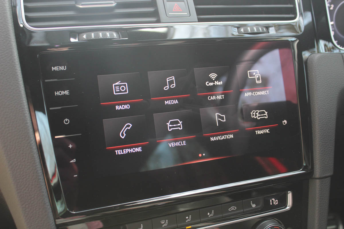
Yet, while stretching the glass screen unbroken right across the Golf’s centre console brings an expressly digital look, it’s at the cost of usability, because the bigger display jettisons all physical knobs, relocating the volume, zoom, home and menu functions into a digital side bar down the screen’s left-hand side.
The lower-tier, eight-inch screen features the same glass front, but a pair of physical knobs puncture through the surface, making volume, power and zoom functions much less distracting — and ultimately quicker to access. Ultimately, we much preferred using the ‘lesser’ of the two systems. How interesting that the larger, button-less screen — which VW ask customers to pay more for — is likely cheaper to produce because of its lack of physical knobs and buttons…
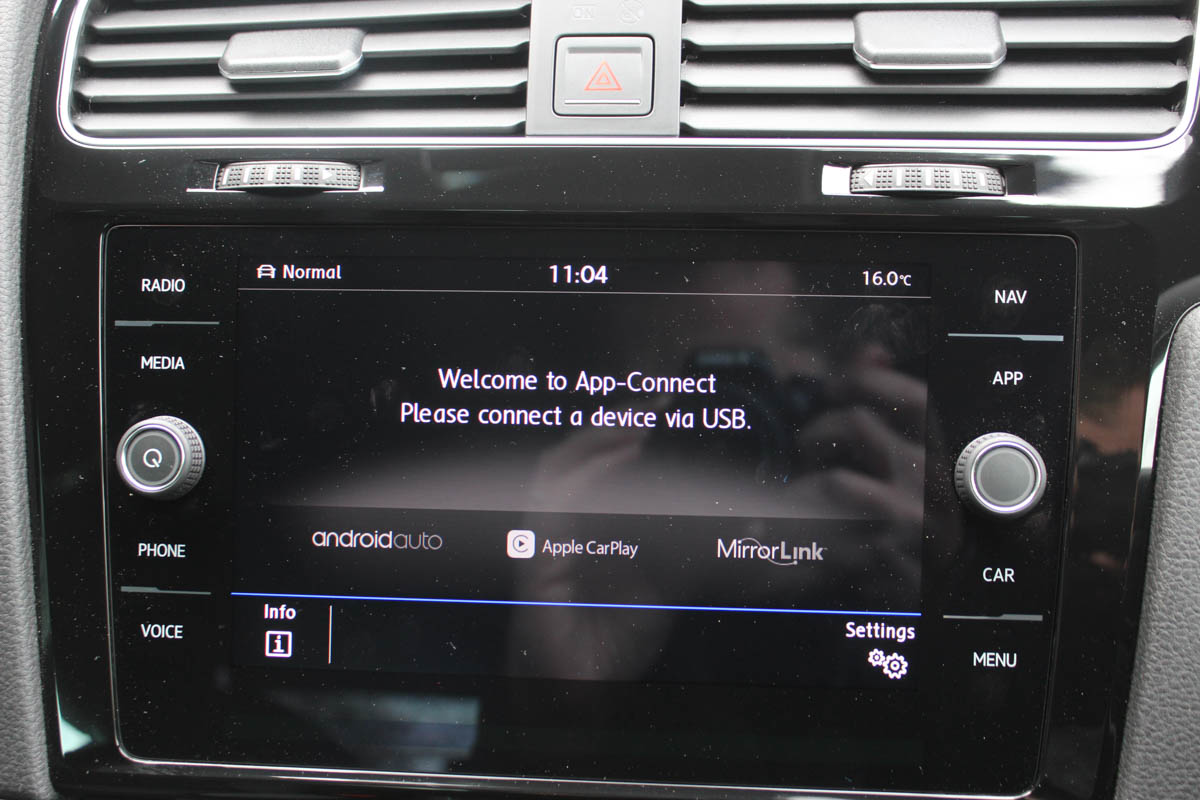
Smaller, cheaper screen is also simpler to use
This smaller screen’s top-tier menu shortcuts (Nav, radio, media, car) also mean primary functions are much easier to navigate around. The larger display only really works when it’s teamed with the digital Active Info Display cluster, because then you can end up arranging driving-related functions (speed and navigation) in the cluster, and entertainment (radio and media) in the centre screen.
Options complexity
Consumers are offered a myriad of hardware choice (centre screen, cluster, wheel and other accoutrements such as a wireless phone charger can all vary) but on top of this, the features they contain sometimes make for a bewildering array of user interaction possibilities and choices.
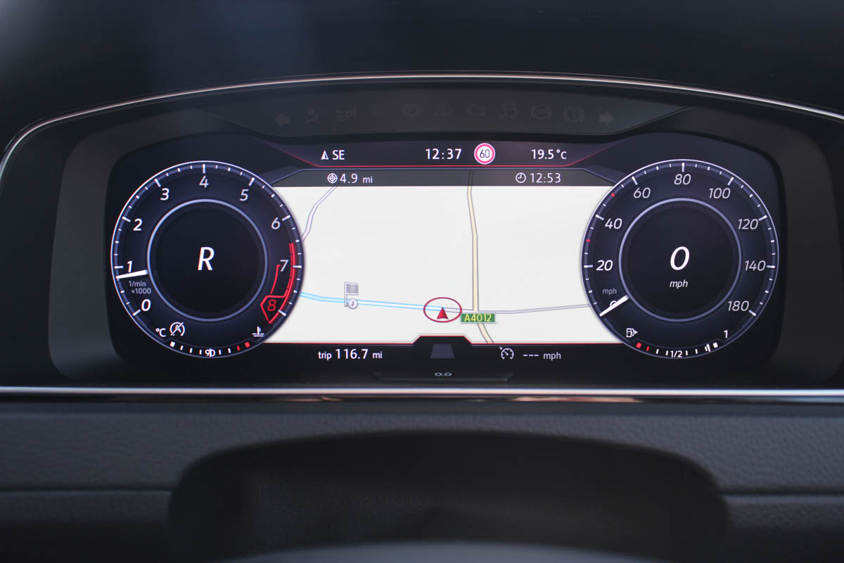
Optional ‘Active Info Display’ replaces conventional dials
The Golf’s approach raises three key questions, to which the industry as a whole would do well to give attention:
1) Does the consumer really understand the benefits of so much choice — do they want it?
2) Why provide such a diverse array of interaction methods? There are four different means of performing certain operations, adding a layer of complexity and choice that is generally undesirable for a good user experience (as a rule, UX designers try to remove the need for the user to make a choice where it’s unnecessary).
3) At what point are car makers going to move on beyond the feature-phone HMI age?
The feature-phone age of in-car interface design
This last point is key. Before smartphones, feature phones continually added new functional features; limited web browsing, messaging services, wallpaper options (etc.) that had a marketable appeal, but didn’t work together in any way and were very restrictive compared to using a desktop computer or a digital camera.
The smartphone changed all that, but not because it was better on-paper in an additive, feature-driven way. Instead it threw away the button keypad everyone assumed a ‘telephone’ needed and it simplified choice. Yes, you could add whatever apps you wanted to, ultimately, but in the first instance smartphones were revolutionary for eliminating feature bloat and the need for the user to make unnecessary decisions. But the killer app was that you now had a web browser, map and camera in your pocket that meant the relevant standalone device became redundant.
This sort of rethink is, right now, what in-car HMI is waiting for. Marketing is winning the day — the Golf’s big headline is that it’s the first in the segment with gesture control technology for the centre screen — but when all the elements are used in concert, the cognitive requirement they create becomes overwhelming and the whole thing stops making sense. The gesture control, though sensibly limited in its operation, isn’t better, easier or faster than using the screen or the steering wheel buttons. It’s simply novel.
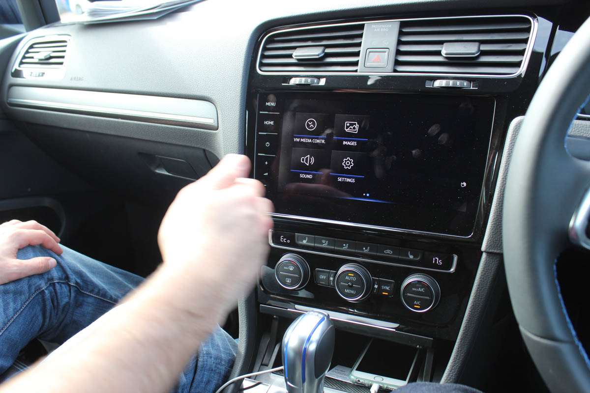
Gesture control noteworthy only for the novelty of its existence
Volkswagen’s online ‘Guide and Inform’ portal provides realtime traffic info, petrol station prices and weather info, but it’s clunky to get to, operating in a standalone way buried deep within sub-menus. Google does a far better job on your phone. Changing a track on Spotify, or need to call a contact? It’s much easier to simply pick your phone up.
Getting the basics right
What VW does get right — and the new technology set-up shows off — is the on-screen graphics. They are mostly modern, clear and easy to read. Fonts, symbols and icons are of-the-brand, providing a consistency across both digital and physical touch points. They look modern. Labelling is clear. So many car brands still fail here, so VW deserves credit for getting this part right.
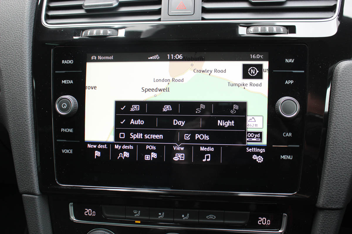
The new screens are responsive too, latency is low and they generally behave like a smartphone or tablet device, so customers will find them easy to relate to.
And at least, when it comes to the headline gesture interaction, in reducing the functionality to a simple left or right swipe option within menus (there’s no twirling hand for volume like BMW), VW has kept things learnable.
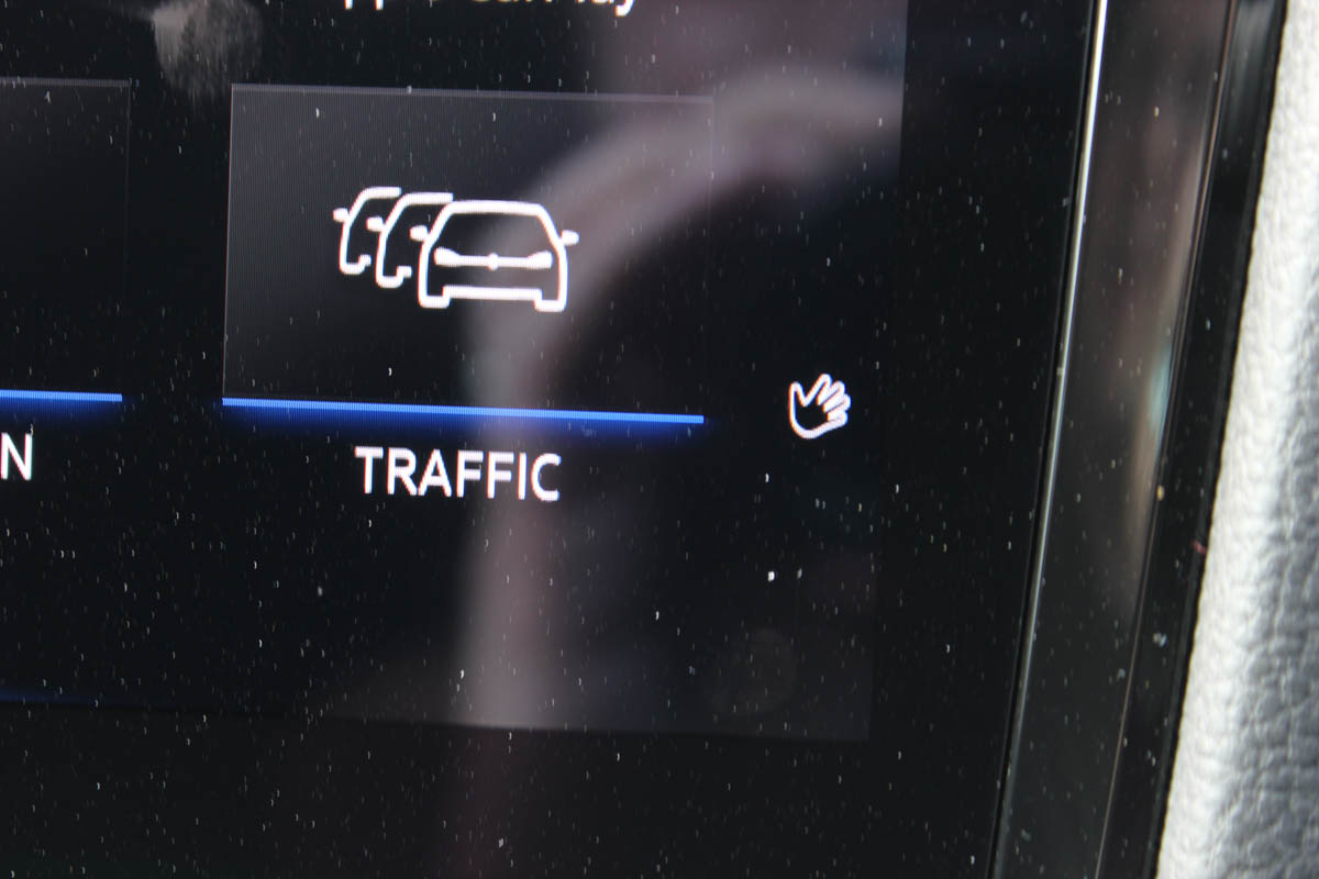
By contrast, the gesture control has a limited range of operation — your hand has to be positioned in front of the sensor, and at a certain angle, which means it tends to carry out your intended instruction only two times out of three (less often when you’re on the move). It’s also tricky at first to know in which menus it’ll work — a tiny telltale wavy hand icon is the giveaway, but we suspect many users might need it pointing out to them.
The confidence to tread a different path
It is ironic that we are talking about a Golf here — a car that defines its class and has rarely sullied itself with the need to compete on feature set. Yet here it is in 2017, engaged in a game of spec one-upmanship when it comes to HMI.
It provides appeal; the system’s now faster and more responsive, and the bigger display with its Apple CarPlay and Android Auto functionality is what many users want.

But beyond the glossy screens, the Golf is an example of how more doesn’t necessarily mean better. The previous Golf VII, with its hard button menu shortcuts, was easier to use. It illustrates how this small but significant corner of a car’s design is ripe for a serious rethink. There’s clear evidence that Volkswagen’s UX designers are up to the task. They just need a management brave enough to let them think in a new paradigm. To do that in a facelift, where the technology platform was fixed a long time ago, was always going to be too much to ask. But the Golf is the perfect car to be the vanguard of a new user interface approach. Maybe Golf VIII will bring about the real rethink?


